Abstract
Use of computer graphic during the past decade have been unprecedented in most visual aspects of basic life, manufacturing and production, as well as presentation, design, marketing and branding of products. This paper reviews on the use of computer graphics in the design and packaging for women magazine Vogue using 120 covers or ten years of Vogue covers in a case study method spanning June 1997 to July 1997. It was able to asses that computer graphics design has helped maintain the classic elegance Vogue has projected over the years with the help of through beautification of model cover photos, newsworthiness and celebrity models, alternate use of colors in separating coverlines, as well as minimal colors used in coverlines.
Introduction
In considering recent description of an artist as against a designer, it has come to pass that designers are in for a tougher act as they work for a larger, mass audience. Ellen Lupton (2007) of AIGA proposed that design, as compared to the fine arts tend to be more of a conservative subject that gravitates towards the client. “Designers serve clients, or so the logic goes, whereas artists serve themselves,” Lupton wrote. While it is the most important thing for painters and sculptors to participate in exhibitions, get their work noticed and talked about as well as being part of a scene and community of artists, designers need clients to survive (Lupton, 2007).
Nevertheless, Lupton (2007) also emphasized that although designers rely heavily on clients, it is not the designer’s ultimate work purpose but share with the client the public audience as designers help clients reach the defined public, the ultimate users of the work. “Designers make things that are out there in the world, being seen, read, understood and acted on by other human beings,” Lupton added. While people or users might not know who designed a certain object they are holding but at some point in their lives, they see it, have their lives enlivened, simplifies or enhanced. So that in the end, when measuring the success of a designer, Lupton suggested that it is whether a work is seen, used or has enhanced people’s lives.
This paper shall try to work on the importance of computer graphics in the branding and packaging of products through design.
Research Objective
This paper shall try to present an overview of design and computer graphics and will gravitate on product packaging using computer graphics, branding through packaging design, and how one women magazine Vogue through its cover fared throughout the years with help of computer graphics design. This paper shall try to specifically:
- Present the role of branding in packaging
- The design process in packaging and branding
- Computer graphics as used in publications
- The Vogue cover and its packaging
- And the role of computer graphics in packaging Vogue.
This study shall try to answer the following:
- What is the role of computer graphics in current package branding for print media?
- What is the role of computer graphics in building the brand of publication?
- How does Vogue magazine’s brand built through computer graphics design in its cover throughout the last decade?
Review of Related Literature
Design
Bierut (2004) acknowledged that, “George Lois’s covers for Esquire provided my first glimpses into the world of graphic design thinking… they were like messages from another world, a world of irreverence and daring. Each was so brutally concise, so free of fat and sentiment. They weren’t just pictures, they were ideas.”
It has been suggested that designers rely on intuition and creativity, of which science may or may not grasp these notions in order to quantify their meaning. Scientists use two approaches: classical and ecological and direct approach to perception instigated by Gibson. The classical approach defines the perception of meaning as a result of a logical-rational reconstruction process heavily relying on memory and how objects are experienced while Gibson contends that meaning should be taken as “behavioral meaning” or what people can do with the perceived object, for action or activities. As objects reflect or emit energy, light sounds, smells, having certain weight, height or resistance to pressure, among others and changes or unchanging patterns of energy may affect point of view that contributes the basis for information or perception of meaning for the object.
Nevertheless, (Keeley, 2001) argued that “…when it happens, good design rises above, surrounds, and is vastly more important than trivial things like commerce. That’s why it’s really crazy for designers to have concerns about articulating the relationship between design and business,” in the Aspen Design Conference.
Designing in this process could be in terms of affordances and effectivities or what people are able to do with their bodies, i.e., the person’s hand and the object should fit in comfortably (Smets and Overbeeke, 1995).
Graphic Design
According to Kinross (1991), graphic design is the activity that evolved out of what has been known as ‘commercial art’ closely linked to advertising, drawn or painted illustration, while the graphic designer is generally is acknowledged even among themselves as professional designers who are able to work across a range of fields with different media. These fields may include companies and corporate bodies, book or magazine publishing, exhibition design, signing and architectural graphics, television graphics, among others.
Hollis acknowledged that through his colleague Philip Thompson’s book (co-writer for Art without Boundaries), designers up to the Second World War were primarily artists who are either painters or sculptors such as Kurt Schwitters, Willi Baumeister, and Friedrich Vordemberge-Gildewart. He also added that there had been a crisis in design as computerized designers go off in one direction led by Basel-Wolfgang Weingart and commercially developed by April Greiman and the New Wave of Americans (Kinross, 1991). “It was something to do with graphic and typographic freedom and with making new images, presenting information as a decorative style… emerged from the new technology of the computer,” Hollis said (Kinross, 1991, p 75). Hollis also believed then that the graphic designer does not control the content of what he or she is designing. He also observed that in postmodernism, there is a large element of eclecticism that borrow past styles and apply them such as what Bruno Mongunzzi, a classic modern typographer and an intelligent designer who is “not highly original … [with the] notion of “I don’t want to be interesting, I want to be good,” (p 75). Hollis delineated art as pre aesthetic information while graphics is information which could inevitably become aesthetic. Hollis and Kinross agree that “graphic design is modernism in the graphic field… the conjunction of image and text” (p 76) of which Hollis emphasized the importance of the relationship between image and text. Lithography (from 1800) was credited to allow joining of image and text laboriously by hand. Likewise, aside from text and image, there was also the conjunction of image and image where photography provided raw material for montage such as John Heartfield’s, and by making surrealism possible — images which appeared to be machine-made. Photography was considered as the central generator of graphic design of the modern movement citing the Volkswagen advertisement in particular (Kinross, 1991). Design as also closely linked, if not overlapped with advertising starting the 1960s. Hollis proposed that it was difficult to separate graphics from marketing which is, “a distinctly bourgeois activity, which has occasionally, probably through pop music, had connections with some sort of mass culture,” (Kinross, 1991, p 79-80).
Kinross (1991) also argued that design symbol must be connected with the boardroom ambitions for the company.
The Composition of Cover Design
Aside from photography, most cover designs rely on typefaces or fonts that convey the text or word message generally being presented by the magazine issue.
When it comes to design and graphics, Brown (2007) introduced the concept of harmonogram in visual design based on harmonic analyses of strings of characters, a contraction of harmonic monogram. [2] emphasized that harmonograms are not harmonographs or physical devices for drawing curves using pens attached to oscillating pendula drawing simple figures such as lissajous figures until friction halts them.
Fourier descriptors on the one hand provide a convenient method for generating harmonograms in synthetic generation of curves.
Brand Identity in the New Economy
A new marketplace made up of new economy brands traded on the internet led to legacy brands from the old economy undergo rapid transformation. The role of branding according to some sectors has been under assault under the new marketplace but this serves as a critical jumping point where identity providers become more vital and critical to ensure that brands in the new marketplace prosper (Kathman, 2002).
The new economy has broken down market boundaries, liberalized trade policies, established tariff-free zones, and the growth of Western style market capitalism with a response of globalization and development of global brands. Market fragmentation has become evident as product diversity, more niche brands and short-life-cycle brands become available to consumers. Likewise, the global buyer has become more sophisticated with better information to facilitate varying purchases and demands. But these trends are all dwarfed by the impact of digital revolution as improvements in compression technology resulted to amazing speed and availability of vast information, changing the procurement process for goods and services globally. Disruption, however, occurred as stock trading, travel and real estate, and book selling (Kathman, 2002).
Brands in the new economy includes eBay, Netscape, Yahoo!, Google, Amazon.com and others confirming that branding is paramount, of which Sir Hector Lang, chief executive officer of United Biscuits PLC said, “Buildings age and become dilapidated, machines wear out, people die, but what lives on are the brands,” (qtd., Kathman, 2002, p 25).
In addition, Temperall (1999) observed that consumers like brands because they generate choice, simplify purchase decisions, offer quality assurance, and reduced risk as they help individuals in self-expression.
Products that were historically cited are Heinz pickles with its famous 57 varieties first marketed in 1869 and Max Factor’s pan makeup capturing radiant beauty in the close-up shots of early Hollywood films. Both became great products that delivered brand promise (Kathman, 2002). Many famous brands at one point in time are either unknown previously or are known but headed for the death row, as brands need investment to win market share and leadership. Kathman (2002) pointed out that the business of investing in brands requires a great deal of effort and financial resources.
The ascendance of expression through product innovation, compelling advertising and public relations are needed to define a brand proposition as well as create equity making the designer role recognized as integral to the work. “Expression has become a critical brand differentiator,” Kathman (2002, p 27) added.
Scmitt (2003) likewise added that “In the world in which brands rule, products are no longer bundles of functional characteristics, but a means to provide and enhance a user’s experience. The traditional paradigm was that communicating brand features and benefits constituted effective marketing. The world of today suggests that marketing must support sensory, effective, and cognitive experiences for consumers,” (p 56).
In the new brand-building paradigm, the role of design is in capturing experiences of brand expressions. Schmitt (2003) pointed out that consumers want to be stimulated, entertained, educated, as well as challenged, where the designer becomes the resource for the expression of the experience.
Brand Management History
It was pointed out that branding started in Ohio via Procter & Gamble Co. when in 1931, it passed the memorandum articulating on the principles of brand management focused on research, development and communication. During this time, grocery stores were being replaced with large format supermarket (Hathman, 2002). Dynamics in selling changed as purchase selection was handed to consumers and grocers replaced by supermarket managers: brands were left on their own and packages need to persuade (Hathman, 2002). Packaged goods manufacturers then adopted the principle of a strong brand identity that supports growth as products need to support the brand recognition by delivering shelf impact in a self-select environment. Manufacturers then understood the need to create beyond impact, a brand image or character using visual expression as softness, strength, fun, efficacy and other moods had to be visualised by the designer. Packaged goods had to deliver important information within proper hierarchies in order to facilitate the selection process so that image and information were required in the self-select process (Hathman, 2002).
Louis Cheskin in 1930s introduced the “principle of Sensation transference” suggesting that there are assigned expectations about products used on the design, color and shape of the packages or bottles that contain them. Taste, efficacy and quality are then dependent on the designer and disappeared from the sales clerk. This led to a packaging-centered world for consumer goods manufacturing as packages become icons and design created image as well as contained brand aspirations and values. The era also required massive television appearance and strong shelf presence.
In the self-select environment, strong branding far exceeded the narrow interpretations of the previous age as it facilitates customer retention and loyalty, and allows for quicker new product acceptance. It is then understood that brand is an experience and that customers shape the brand, letting the designers expand the principle of sensation transference to include consumer touch points beyond the narrow packaging centric world.
Today, the designer is required to understand the expanded theatre for brand identity such as the need for in-store branding, via packaging and merchandising. There is the direct-to-consumer communication that involves careful management of design assets encompassing interactive media that accepts the principle of effective brand identity. As Hathman 2002), wrote:
“Brands across a variety of goods and services today understand that managing identity at all consumer touch points is essential to their survival and prosperity. Brand identity development is now media neutral. We no longer simply design a package for consumer products. Rather, we create a franchise of color, shape, textures, and typography to serve a brand in all applications,” (p 31).
Brand in Print and Print Culture
Barchas (2003) presented an interesting view on the study of printed culture starting from the 18th century showing how the very form of the printed text merges with its historical and literary meaning. The paratextual materials of the early novel, particularly its visual and physical aspects, worked to shape the meaning of the novel itself as a genre in the book marketplace as well as persuade readers to buy such novels and admire them. Barchas (2003) proposed that novelists facing a public skeptical abut merits of the novel as a genre, used graphic features, frontispieces, packaging, indexes, punctuation and presentation to define and elevate the genre in the eyes of readers as well as illustrate and emphasize a particular features of the story as to “contextualize the manner in which the novel genre’s original audience read and experienced the new species of writing,” (11). The novel, as well as any visual product, is a part of a competing market of flexible, multiple, mutating printed forms battling to establish or renovate printing convention to advance its own form where a specific aspect of graphic presentation in conjunction with literary interpretation of a central novel of the given period in each chapter. She examined the signals of costume, posture, expression in portraits and how the presentation of the author inflects the truth claims of the text and reinforces or undermines its claims to authority and authenticity.
The crowded title pages of the early novel, according to Barchas (2003) articulate generic instability and the need for advertising the books’ contents but are deceptive, circuitous and misleading impulse in the novel itself. In featuring Samuel Richardson and Sarah Fielding’s David Simple, Barchas describes a more direct, authorial direction as the texts are linked with the authors’ awareness of a feminine audience with their pro-feminism. As such, the punctuation, Richardson’s intended inclusion of a musical score for Clarisa, the printer’s ornaments and footnotes serve to provide dramatic, dynamic and interpretative signals (Barchas, 2003). Yampbell (2005) acknowledged that the cover of a book is often a reader’s first interaction with it and the consumer’s initial reading of the text and provides visual intrigue in the bookstore to entice a consumer. “Cover art is a key factor in a book’s success,” Yampbell (2005) wrote (p 349). Accordingly, Powers ( ) emphasized that “The design of book covers helps to make a book something more than mere “information”, something that, even though it may have many thousands of identical siblings, still demands a relationship, something that when given, defines the values of the giver and recipient. The best book covers posses a form of hidden eroticism, connecting with some undefended part of the personality in order to say “take me, I am yours.” (11).
So much like manufacturers, publishers give importance to the entire design of a book: the spine often regarded as the sole introduction to a potential consumer, size, shape, paper texture, font, among others so that its “grabability” becomes a key marketing concern which means that the book must visually leap off the shelf and grab the consumer’s attention in order for the consumer to buy or grab the book (Yampbell, 2005).
But as consumers increase in number, quality and feel of the hardback that leads to its desirability make hardcovers unaffordable for many. Mass market paperback was introduced in Britain by Penguin in 1935 with the imprint denoting quality literature at affordable prices.
Nevertheless, Kernan and Foucalt (1987) suggested that printing promoted a consistent as well as unchanging notion of authorial sensibility and meaning at odds with the psychology of at least some eighteenth-century readers
It had been noted that the packaging of text was previously neglected by publishers but are now carefully manipulated and altered as publishers and marketing experts acknowledge what has been a necessity among goods manufacturers long ago: visual appeal to succeed among consumers. Holograms, digital art, metallic jackets, covers and blurbs must attract printed reading materials to avoid disappearance among the hundreds that will no longer be printed per annum (Yampbell, 2005).
In marketing publications, it is important to address what Yampbell (2005) enumerated as:
- Materiality and Marketing – to consider desirability and production cost at the same time. Random House Children’s Publishing director Kate Klimo commented in 1998 that “The marketplace is tougher today. You need every advantage when everybody is competing for the same customer, the same shelf space. More than ever, the cover is seen as packaging, the poster for a book,” (qtd., Maghan, 1999).
- The Audience – to whom or what group, age range, gender or social class a publication is intended for. In a 1998 survey conducted by Publishers Weekly and Book Expo America indicated that teens spend nearly ten percent of their disposable income on books (Scott, 1998) and another study conducted by the PW/BEA indicated 57% of teens agreed that the book’s cover is the greatest influence on their choices (Scott, 1998).
- Location – where must these publications be shelved in order to reach their intended audience.
Magazine Design
Cleveland (2005) suggested that the visual grammar of a particular magazine is developed over time as a result of interaction between the identified audiences, the cultural context in which the audience function, and the magazine publishers so that the lay-out of magazines is a design activity as well as an established business practice which transforms editorial material into visual communication.
It is then expected that audience interacts with the material presented on a page to obtain value from it. “The page boundary, magazine dimensions, contents and layout all interact to various aspects of grammar. Elements such as photographic compositions are made up of various signs that are then coded by the choice of subject, gestures, framing, lighting and subject color choices,” Cleveland (2005, p 271) wrote. It is also expected that the same image can produce different meanings within different cultures as those who do not produce or have skills for images must rely on those provided by other people called designers who create and layout for large audience interpretation and of great importance in the marketing of magazines (Cleveland, 2005).
Cleveland (2005) acknowledged the use of software as an aid to manufacturing these coded images and graphics and themselves having their own coded system as collating of images and layering of page furniture has its own technology with effects oriented towards the creation of an environment which many readers are expected to be drawn.
Cleveland further mentioned three concepts relating tot eh layout design of magazines:
- Visual language – a set of graphical symbols, which according to Marriott and Meyer (1998) are valid sentences in a given language. This tends to be dynamic and modify themselves over time where different languages associated with differing forms of communication exists: Mathematics, CAD system, photography and computer languages.
- Visual grammar – pertains to the grammar of visual language where the creation of visual grammar emerges from different cultures and sub-cultures that invent ways of compiling visual components that necessitates communication of ideas which cannot be expressed in words alone. Cleveland (2005) proposed that “Visual grammar is synthesized in the different ways imagery, type and media are used.” (272).
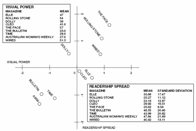
- Visual power – This is the degree of stimulus emanating from a given design of which a higher stimulus leads to a greater degree of attracting attention. Described by Baird (1993), the stimulus could be in the form of impact of layout, unorthodox use of design elements or the degree of innovation in the layout.
It was emphasized that the primary function of page layout design is to help organize the visual and textual elements in order to increase or facilitate absorption, transmission and interpretation of intended message and information. The format of the magazine may allow different methods of absorption and read in linear fashion, as well as non-linear manner by flipping through the various pages. But interpretation may be dependent on previous experiences and exposure to same materials.
But although design has been consistently acknowledged as an essential component of grabbing a viewer’s attention, there are also publishers who see it as icing of the cake and that King (2001) argued there are plenty of cakes without an icing. Innovative design, however, is seen by other publishers as its route to success as Nark Hostetter of TransWorldSurf was quoted saying the analogy, “that other surf magazines resemble museums and ours is more like a video game,” (qtd. fr King, 2001).
Chandler (2000) pointed out that semiotics is a common tool for the analysis of text, photography and time-based imagery where a semiotic analysis examines the signs within an image or text to characterize structure and identify potential meanings. O’Sullivan et al (1994) further added that every medium such as radio, television and magazines transmit codes via channels. The channel is the sensory mode of t
He medium and the physical characteristics of the channel limit the medium and codes it can carry. Likewise, it has been argued that verbal language no longer dominates our interpretation of visual communication (Kress and van Leeuwen, 1996). Their theory of visual grammar contains;
- visual representations that need a narrative in the form of a vector which represents the direction the viewer must take when reading a visual: a linear or curved path where linear represents science and modernity while curved path represents the organic or aspects of nature.
- Conceptual representations of two forms: hierarchical trees with clear differentiation between primary, secondary or other relationships, and holistic versus detail.
- Images that interact with the viewer such as a photo of faces looking at a viewer having a strong drawing effect
- Contain modality markers which gives clues to the dependability and genuineness of the image
- Possess an overall organization through the use of composition that adds meaning to the individual elements through position, placement, size, contrast and weight.
- Contain sense of rhythm
- Contain inscription characteristics which can be made from marks made by hand, or those recorded and synthesized through the use of technology (Szczelkun, 2002).
It is further noticed that there is no common identifying language of magazine layout which can be used as base for evaluation. In most cases, it depends on the typography used, the words, the texts chosen, and the visual language created by the photography, illustrations or graphics (Yampbell, 2005), thus, it has no common syntax or grammar. Yampbell (2005) proposed that each individual magazine has either developed or borrowed its own visual grammar as it incorporates elements that make up a page layout.
Cues are then found within these elements which semioticians termed “modality markers.” These cues refer to reliability, credibility, truth and accuracy of texts and images which are then compared with the readers’ interpretation of reality drawn from their previous knowledge as well as the medium (Chandler, 2000). Comparisons of categorization can be made on the features within a magazine design offered by modality features. De Grauwe (2003) pointed out that the credibility of a magazine layout which is represented represents the truth of a particular social group which varied on the group’s reality principles.
Modality is then referred to as the truth value of a sign with three recognized kinds: actuality, (logical) necessity, and (hypothetical) possibility (Hodge and Kress, 1988). Visuals in this manner either represent artifacts as they exist or as fantasy while modality judgments or truth value are relative to the social milieu of the viewer (Kress and van Leeuwen, 1996).
Identification and segmentation of the magazine market is sophisticated process based on extensive research whereas the application of design to the use of realistic codes usually rely on the same formula in applying design solutions to magazine titles (Yampbell, 2005).
Szczelkun (2002) proposed that, “The grammar of verbal texts and images has developed side by side, so, there is bound to be some congruence, but these similarities should not lead us to expect a linguistic model of grammar in the visual domain. More radically, they suggest, the past dominance of literary should not lead us to conclude that the visual domain is inherently dependent on the linguistic.
Circulation and readership is the measurement of success for a magazine while lifespan of each magazine issue is short with currency of material (Magazine Publishers of Australia, 1999). Likewise, the design not only provides a framework for functionalism but content goes further to consider the short lifespan which also affects page layout (Heller, 2003). Magazines take on many formats, graphic experiment and expression within the bounds of editorial responsibility and market penetration. The designer usually works in with a team with other editorial and photographic personnel in order to develop the visual grammar needed for the magazine (Yampbell, 2005).
Various magazines require different solutions to their design, such as a newsmagazine ranking stories by importance and placing them in proper order requiring an easy navigation system. This is a formula-driven approach governed by operational demands of collecting editorial materials. Influence of sub-cultures that exist outside the mainstream publishing industry, editorial liberalism, and establishment of new production technologies led to deviation of formulas (Owen, 1991). As such, large publishing companies survey the market demographics and target the editorial content to satisfy a particular market segment while designers juggle creative solutions and present technically trained visual messages. The MPA (1999) proposed that many magazines operate on the principle of generating interest and surprise by making each edition a new and fresh experience, or to reinforce familiarity as a reward on purchase. Editorial departments are kept intact to establish a consistent character for the magazine over time and still, there is a continuing search for ways to generate sustained interest for a buying public that requires ever-increasing levels of visual stimulation through increases in arousal.
Arousal potential, according to Berlyne (1971) is a manifestation of aesthetic preference and can be transferred to mass produced pieces of popular culture but it is originally defined in terms of work of art. There are three arousal-potential properties:
- Psychophysical – aspects such as the colors, pitch, and intensity.
- Ecological – meaning and symbolism behind the imagery
- Collative – aspects such as novelty, complexity and incongruity.
It was suggested that the higher the proportion of these properties in an image, the greater the degree of arousal potential which helps counter the effects of habituation among observers and potential readers or consumers. High levels of arousal potential design are essential in gaining a viewer’s attention (Yampbell, 2005).
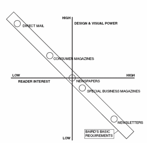
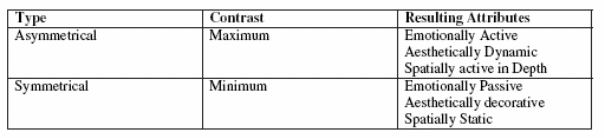
As commonly perceived, every magazine approaches design in a different way as some may copy trends from similar publications and still, various considerations influence what imagery and how that imagery is presented. A survey of magazine newsstands show a grouping of similar style treatments but others could be radically different. Although all magazines have some visual power, but there are differences that are imbedded into the design or difference in formalization. Some magazines such as the Australian Women’s Weekly has type of code that requires the design be organized in such a way that the majority of people who read such a magazine relate to the visual grammar as determined by the code to some extent. Page layout was also typically described as asymmetrical or symmetrical but Yampbell (2005) suggested this does not describe attributes as well as a dynamic and passive attributes.
Yampbell (2005) found in his study there was a connection between relationship spread and the amount of visual power employed in the design and layouts. The following table showed multidimensional scale indicating magazine groupings with similar application of visual power grouping together. Likewise, the study suggested that the wider the readership spread, the lower the visual power value reversing what Baird has posed earlier about readership of non-focused print material that require larger amounts of visual power.
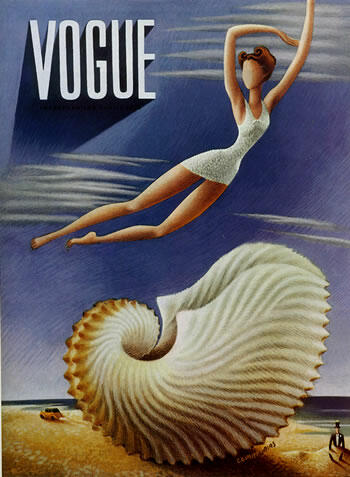
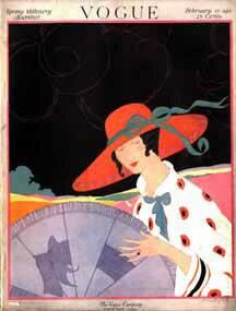
Grow (2002) provided an interesting magazine cover changes observation through history, noting in particular, use of cover lines. While early magazine covers placed cover lines as well as table of contents in book-like manner, beginning the 1890s to 1960s, one type dominated which is the poster cover as many outstanding professional illustrators learned their craft from artistic posters of the Art Noveau movement such as Mucha conveying onto the page with the aid of a small army of skilled engravers graphic designs. Charles Dana Gibson and Maxfield Parrish became nationally famous as covers were printed as to be framed and hung on the wall (Grow, 2002). Most poster covers between 1890 and 1940 rarely relate to a story inside the magazine but depict a season or general mood (Johnson and Prijatel, 2000).
Tracing from McClure’s July 1916 issue, cover lines mingled with the poster cover so that Grow (2002) suggested that, “While many magazines boasted artful poster covers, others relied heavily on cover lines to draw readers inside in a more definite way than the cover art could accomplish.” Methods that are reinvented were enumerated as:
- “a large title with the model’s face overlapping it
- a model in a (nearly) full body pose
- a model in an unusual and expressive posture (rotated somewhat, spiraling down to the bottom cover line)
- cover lines on all sides of her, carefully positioned in relation to the model and the background (“The Amazing Fraud” is written across the beam of the sailboat, other lines appear against the sail),” (Grow, 2002, Annex D).
Grow (2002) pointed out the combination of activity and repose, in his words, “a restful confidence combined with outdoor recreation” as primary and secondary set of cover lines consisting of lists and large, effective secondary cover lines at the bottom of the picture in contrasting type and color. Grow (2002) added that placement of type on the picture adds to the sense of depth obtained in layering of planes. Likewise, in addition to the absence of powerful photographs, designers implicitly followed the advice of Alexy Brodovitch, art director of Harper’s Bazaar during the 1930s: “A layout man should be simple with good photographs. He should perform acrobatics when the pictures are bad” (Remington & Hodik, 52). By the 1960s, cover typography as exemplified by the cover of the May 1968 issue of Vogue began to break out of the quite, restrained captions and speak in many varied and bolder voices as large type in color and striking fonts in different sizes (Appendix E).
1980s and 1990s magazine designers added design acrobatics with good photographs together to produce exciting “totters on the verge of exhaustion,” (Grow, 2002). Competition has been so stiff even famous models shot by famous photographers had to have competitive cover lines in out-shouted type. A December 2001 surveyed of magazine covers in a large Border’s bookstore indicated that out of approximately 1,200 titles on display, only 92 had poster covers of bold graphic covers with no more than a modest cover line or very modest group of small cover lines. It is about 8 percent while the other 92 percent used vivid, large, prominent coverlines that seem to force models to withdraw to a smaller image and interleave with the text, make room for announcement of contents, or become a billboard. Likewise, Grow noted, among others that magazine cover design of the 1990s have:
- “The model is turned, folded, or strongly cropped to make room for the cover lines.
- Her head overlaps the logo. (Less often, the logo overlaps the head.)
- A large cover line (also called it the “subtitle”) cuts across the lower middle part of the cover, competing in size with the magazine’s title.
- Cover lines appear in several fonts, sizes, colors, or styles.
- The elements in the cover are carefully arranged to create the illusion of layers of depth — one element strongly suggesting that it is on top of, or behind, another. Often, this effect is accentuated by type that is overlapped (as in “Amazing” and “Beauty” on this cover).
- There are often two columns of cover lines, plus another across the bottom or middle. Sometimes there is a small cover line above the logo.
- Cover lines press in upon the cover model. They sit on top of parts of her body. The most expressive parts of her image are left uncovered, but we glimpse them through the screen of words, the labels and lists and contents that occupy the same air she breathes, so that the model’s charisma and the type’s vitality interpenetrate one another to create an aura of undefinable excitement around the topics inside the magazine.
- Many covers, like this one, are color coordinated. All the colors, from background to logo to clothing to the colors of the typography, make up a harmonious whole.”
Likewise, Grow (2002) commented that, “models on magazine covers look at us through the listed contents of those magazines, which they practically wear like a garment, or stand in, like an aura. And we look back at them through the aura of our own ongoing narratives, our individual tables of contents, our personal cover lines.” In fact, by the turn of the century, Grow also noted that, “early 2000s are so immersed in commercial typography, channel-hopping, web-surfing, consumer culture, competing values, and objects clamoring for attention that the picture of a cover model cheerfully or seductively immersed in a forest of words may seem to us a mere depiction of daily normality — a normality both reflected by and fueled by the words on the covers of magazines.” These are evident in practice even in the advent of highly innovative computer graphics design software.
Tuczyn (2005) noted that even mainstream magazines in the 1920s to 30s lured in readers with distinctive design, original typography as well as striking artwork where the cover is comparable to a canvass and not a billboard notably by art directors like Mehemed Fehmy Agha for Vogue, House & Garden, and Vanity Fair, Alexey Brodovitch for Harper’s Bazaar, and Eleanor Treacy and Francis Brennan of Fortune. The order of the era was to create the most ravishing covers possible to distinguish a magazine from its competitors.
Vogue History and Overview
Vogue was founded in 1892 chronicling New York’s social elite to become an active participant in the culture of fashion under seven successive and formidable women editors-in-chief (Angeleti and Oliva, 2006). As clearly acknowledged, the publication has insistently juxtaposed surface with substance that have been evident on its covers as it became the first magazine to have a cover with a color photograph in 1932. Vogue is also acknowledged to have innovated the look of magazines everywhere as it allowed more detailed presentation of models’ clothing.
It has been commented on that magazines like the British Vogue were dismissed as somewhat irrelevant even in its social context as part of recorded histories’ sexual identity in forms of mass culture. It was suggested to be considered as “modernism’s effeminate other as well as considered queer for being obsessed with unproductive gossip and transient role-playing as well as openly courting the homoerotic gaze (Huysen, 1986). In a study of British Vogue in the 1920s (White, 1970, p 94) proposed that Vogue’s “garish and esoteric assortment of fashions designed to appeal to those with extravagant tastes and ample resources … transformed the simple desire to be well-dressed into an exorbitantly expensive and time-consuming profession beyond the reach of all but the most affluent.” This proposition alone poses two contrasting views of “simplicity” and “extravagant taste” (White, 1970, p 118). Another prejudice noted is in condemning British Vogue as “silent collusion in the promotion of a heteronormative agenda… nothing that evinced a homoerotic sensibility… ever made it onto Vogues pages,” (Garrity, 1999, p 35). Reed (2006) however pointed out that, “almost every page of the arts and culture coverage in British Vogue during the 1920s is queer — intriguingly, delightfully, powerfully queer. I intend “queer” here in its broadest sense, to indicate an attitude that delights in destabilizing institutionally sanctioned hierarchies that, to this day, distinguish “art” and “design” from “fashion and “decoration,” and (perhaps accounting for the consternation Vogue has aroused in academics) the publishing organs of the intelligentsia from mass-circulation magazines (Luckhurst, 1998). In addition, Reed acknowledged Vogue’s enthusiasm for androgyny linking it to sensibility. Physique magazines are acknowledged for their historical significance on sexual identity as prefigured by British Vogue as it relished gender-bending as a form of performance linked with other kinds of modern aesthetics. Vogue propagated dynamics of sexual-identity formation in advanced capitalism of 1950s where gender segregation was the order (Reed, 2005).
Vogue, in return claimed to be “young” for its sensibility translated as “Bright Young People” or “Intelligent Young persons” in journalistic nomenclature defined by an attitude of delighted transgression against convention (Graves and Hodge, 1963). It has also been commented on, as part of Vogue’s packaging in that era that anecdotes reveal a subculture that delighted queerness and performance that challenge the shame associated with the usual dynamics of seeing deviance or inadvertent display or unwanted exposure. Witty sketches decorating tables of British Vogue content evoke ideal of fashion as performance (Reed, 2005).
Prior (1980) acknowledged that Vogue carefully integrate editorial content, graphic design, and advertising to create a successful magazine package considered a phenomenon of the last half of the twentieth century. It was noted that as early as the 1890s, the first publishers of “Vogue” magazine already established an editorial-advertising-design mix in the fashion magazine that attract a highly specialized audience, appealing to their particular interests with a unique combination of ingredients. Conde Nast’s publisher Arthur B. Turnure, in 1909 develop approaches to the magazine’s marketing and content and the next 20 years brought the integration of the editorial content, the graphic design of the magazine, and the selection of specialized advertisers to a new state of the art.
In addition, Reed (2005) wrote that visual culture was crucial to British Vogue’s presentation of the new sensibility and potent in disrupting the forms of institutional authority reified in the conventional canons of art and design history. “… the look of the “modern” as it was presented in Vogue lies so far outside conventional accounts of modernism… the Amusing style (Alan Pryce-Jones qtd. in Pearson, 1978). Like fashion of youth — two closely related terms in Vogue’s lexicon — the criterion of amusement privileged an attitude of transient delight over claims to timeless or essential verities,” (383). Likewise, it can be credited that Vogue’s pictures not only documented brilliant representatives of the generation of Edith, Osberth, and Sacheverell Sitwell (Mortimer, 1924) but also their creative activities and domestic environments.
Crawforth (2004) noted on the changes of Vogue cover designs as well as its articles and illustrations to have infiltrated the arena of high surrealism in the late 1930s and early 1940s. In the June 1, 1939 edition of Vogues, Salvador Dali contributed to both the cover art work and several pieces noted to have used metaphor employed as surrealist. As such, Krauss (Krauss, 1987, p. 4) “…Surrealist photography does not admit of the natural, as opposed to the cultural or made. And so all of what it looks at is seen as if already, and always, constructed, through a strange transposition of this thing into a different register…”
Likewise, even its advertising credits designers as Weber placed it: “Now receiving fuller credit for their work, designers returned the favor by placing more advertisements in Vogue, whose revenues increased accordingly. The powerful symbiosis between journalism and advertising was born.” Revolutions, likewise, were credited to the magazine’s covers as in the youthquake of 1960s when Diana Vreeland placed the lanky, androgynous teenagers that made “undernourished” the new standard after the curvaceous models of the previous decade. Grace Mirabella featured for the first time an African-American in its cover while Anna Wintour reshaped the era’s stylistic ideals by featuring a model with bejewelled Lacroix jacket and a pair of jeans in three-quarter-length on her first cover.
Aside from promoting a new form of chic, Wintour’s debut cover was credited to have “brokered a class-mass rapprochement that informs modern fashion to this day,” (Weber, 2006).
As mentioned earlier, celebrity covers has become a trend among magazines with notable changes on cover lines starting the mid ‘70s when magazine cover lines are no longer unobtrusive captions on huge posters and invaded the cover space authoritatively, “shout in anger, whoop with glee, broadcast great news, announce incredible discoveries, whisper across huge rooms with sophisticated stillness, rise off layers upon layers of cover depth and take readers by the elbow to dance, and proclaim how urgent it is that readers recognize how much promise awaits those who slip between these covers,” (Grow, 2002, Appendix F).
Likewise, art and design for the new millennium has also came with it with the “brutal reality of today’s retail climate forces most magazine-makers to forgo pure loveliness in favor of cleverness or sexiness or wackiness,” Neuhaus (2003). And although eyes still land on the covers of magazines, experts warn cover designers there is only a few seconds to sell a magazine in a newsstand as colors, fonts, images and coverlines are manipulated in a million ways with the ideal dependent on what sells in the international idiom of commerce (Neuhaus, 2003).
There had been varying opinion among magazine editors with regards to what sells as this has been totally dependent on the covers. Coverlines, as earlier mentioned, is a critical, if not essential in a cover as it has been tagged the deciding buy factor accounting for as much as 90 percent of cover impact (Gonser, 2003). However, editors still disagree how many words are ideal with the consensus that three seconds is all the cover has got to sell. While two words could be maximize message, Vogue (October 1997 showing the late Princess Diana) and other magazines like Rolling Stone, at some point, prefer no coverline at all. The editors also recommended images of who is hot, or newsworthy. The number of faces shown on the cover has also been decided on to be two or less as better whereas colors have no permanent effect. (Gonser, 2003).
One respondent to the Pop Cult article defended Vogue’s branding strategy as “That’s the ultimate purpose of branding–to get consumers/readers to form an emotional bond with their “Vogue” magazine, not with Giselle Bundchen as brought to them by Vogue. If the brand were truly marketed successfully, consumers would respond simply to recognizing Vogue, along with its signifying design elements (whatever those might be: its distinctive masthead, style of photography, or text treatments) for itself, because they’d come to identify “Vogue” and the information it contains as a can’t-do-without element in their lives. But instead, all of these branding efforts seem to have been subverted and many magazines are merely vessels for the celebrity or product du jour; consumers don’t necessarily love Vogue for Vogue, they love Vogue because it brings them closer to Giselle Bundchen and her Balenciaga peasant blouse,” (quoted Phillip Rhodes from Pup Cult mail room, Turczyn, 2005).
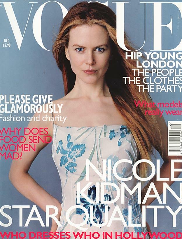
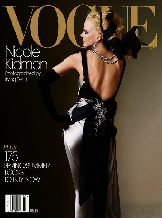
In the American Magazine Conference in 2005 held at the Wyndham El Conquistador in Puerto Rico, Vogue garnered 32nd rank, for its May 2004 (Appendix 1) Nicole Kidman’s back profile dress in an elegant gown (MPA, 2005). The “32nd ASME’s Top 40 Magazine Covers of the Last 40 Years” show Vogue’s May 2004 issue photographed by Irving Penn showed Nicole Kidman’s back profile dressed in a Christian Lacroix oyster satin backless dress. This was the first cover shoot for Vogue by Penn since 1989 containing more photographs of Kidman dressed as a Grecian goddess, an Italian diva and as legendary actress Sarah Bernhardt (MPA, 2005).
Research Methodology
This study shall use case study on the role of computer graphics on branding techniques of print publications with focus on the design and branding or packaging for women magazine Vogue covers from August 1997 to August 2007.
Case Study
The case study shall determine recent struggles undergone by the print media as new forms of media such as the internet has posed threats on the marketing, specifically branding of women’s magazines. The focus shall be on the role of computer graphics on branding and marketing of women magazine in this new market era, specifically Vogue magazine between July 1997 to June 2007. Case study research could bring an understanding to an issue such as on maintaining competitiveness of Vogue magazine through the use of computer graphic design and packaging in its magazine cover. This case study shall limit and emphasize contextual analysis of a limited number of conditions such as the introduction of a new market, which is e-commerce, and its relationship to the packaging and branding of Vogue’s cover design. Yin (1984) pointed out that a case study research method as an empirical inquiry investigates a contemporary phenomenon within real-life context where phenomenon and context boundaries are not clearly defined, and multiple sources of evidence are needed to support a point.
Although the case study method had been criticised that the study of a small number of cases offer no grounds for establishing reliability or generality of findings, other researchers feel that the intense exposure to study of the case biases the findings. Others insist that the case study research is useful only as an exploratory tool but success in carefully planned and crafted studies of real-life situations, issues, and problems had been noticeable.
Soy (1996) enumerated the following steps for organizing and conducting the research:
- Determine the research questions. In this process, the following questions shall be addressed:
- What is the role of computer graphics in current package branding for print media?
- What is the role of computer graphics in building the brand of publication?
- How does Vogue magazine’s brand built through computer graphics design?
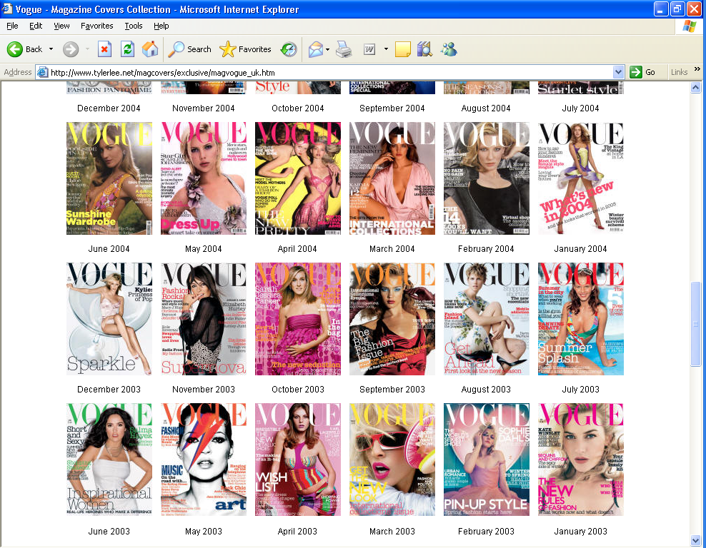
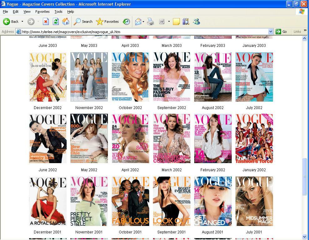
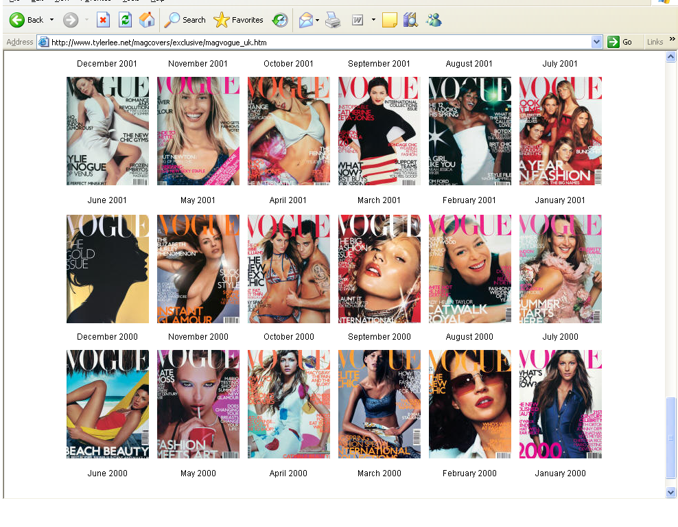
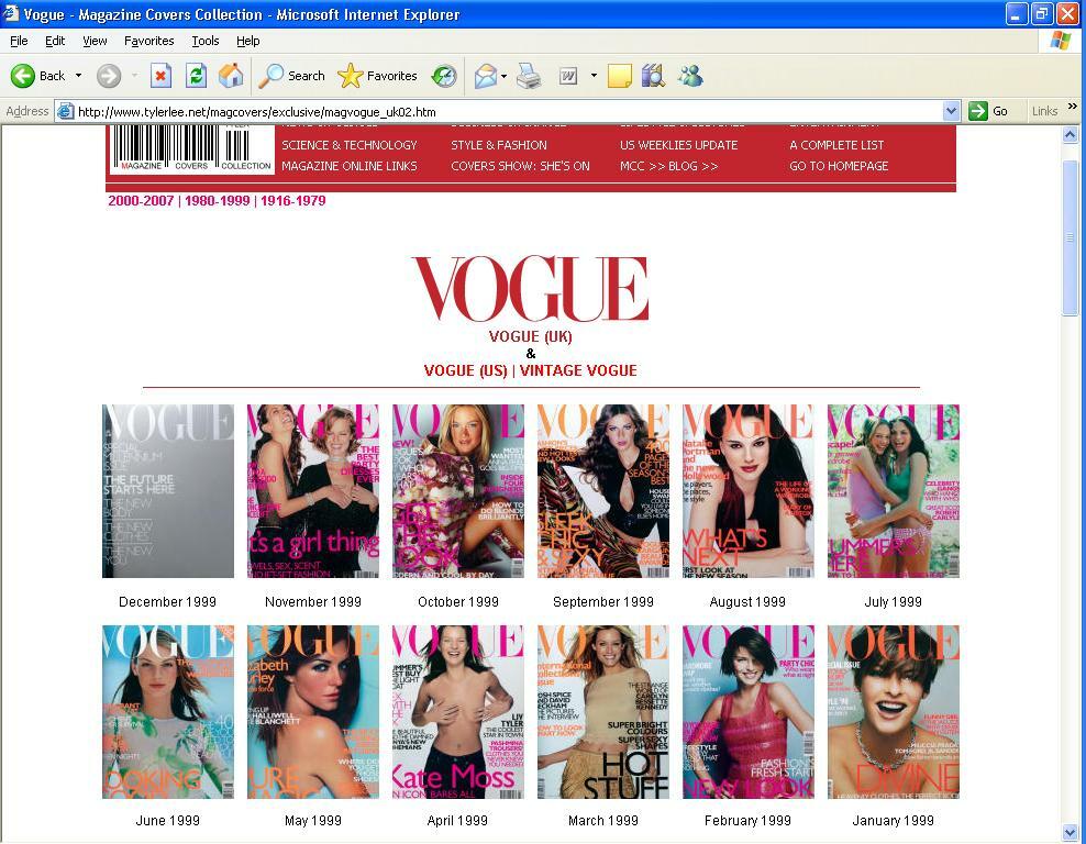
- Select the case and determine data gathering and analysis techniques. The case in this study is the use of computer graphics in Vogue cover design and the role of the design in the branding and packaging for Vogue magazine. A decade of Vogue cover designs shall be carefully studied, described, and analyzed in the context of computer graphics used and the magazine’s overall branding or image. Cover issues from July 1997 to June 2007 shall be presented.
- Prepare to collect the data. The cover of all issues of Vogue magazine from July 1997 to June 2007 shall be presented. Photos of the covers are included in the Appendix.
- Collect data in the field. Data shall be presented on the next chapter. Each of the covers of Vogue shall be presented with the computer graphic design or techniques used.
- Evaluate and analyze the data. Evaluation and Analysis will be presented on the following chapters. Analysis will include the role and effect of the cover design of Vogue in the packaging and branding of the product which is the magazine.
- Prepare the report.
Presentation of Data
The Vogue covers under Study
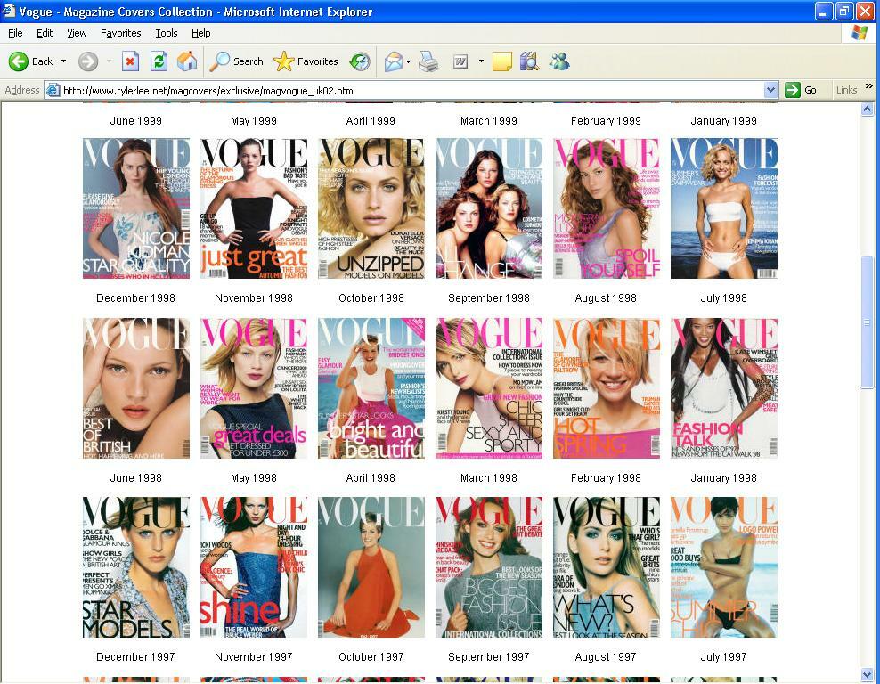
The Vogue covers under study shall include some 120 issues specifically July 1997 until June 2007 spanning a decade of Vogue computer graphic contribution on Vogue cover design that helped build or maintain packaging for the magazine.
Vogue Status
Vogue is a fashion and lifestyle magazine currently published in several countries in various editions by Conde Nast Publications described by Weber (2006) as, “Vogue is to our era what the idea of God was, in Voltaire’s famous parlance, to his: if it didn’t exist, we would have to invent it. Revered for its editorial excellence and its visual panache, the magazine has long functioned as a bible for anyone worshiping at the altar of luxury, celebrity and style. And while we perhaps take for granted the extent to which this trinity dominates consumer culture today, Vogue’s role in catalyzing its rise to pre-eminence cannot be underestimated.”
Recent Developments
2005 saw a good year for women glossies or magazines that include among others Vogue magazine, yet sister publication Glamour posted higher sales, accordingly with total circulations increase by a fifth in the first half of the year as indicated below:
Figure. 6.Top five women’s monthlies (end 2005) Source: Audit Bureau of Circulations, 2003
Vogue, reported a whooping advertising pages of 727 in its September 2007 issue with its cover proclaiming “extra-extra large!” size and a hundred pages thicker than the last year issue which, as observers claim, provide evidence of healthy print advertising in the fashion industry (Aspan, 2007).
The Title Logo
In the advent of computer design, most everything that has been a tradition among products packaging were either retained, improved, or overhauled. In the case for Vogue, title logo has been maintained since Vogue uses a consistent title logo type font for the whole decade under study: the all capitalized VOGUE letters in news font. The use of colors, nevertheless changes from time to time from all black, to all white or reversed, all red, a variety of all pink shades, yellow, yellow orange, orange, a variety of blue shades, green, gold, silver, and one mixed: November 2005 cover using blue and red. Another cover, the December 2006, used a collage of magazine Vogue covers with the title logo over-imposed on the collage covers with their own logo.
Cover Lines
From among the 120 covers of Vogues magazine, with the use of computer graphics in lay-out and design, the following are noted with use of colors to separate coverlines:
Table 1. CoverLines
It was observed that the most prevalent design concept for coverlines uses two colors of light and dark. In instances where one color is used, it is white, black, orange, silver, gold, or pink. The use of a single color and two colors were maintained all throughout the decade.
The Cover Photo Models
For the decade under study, the cover models for Vogue are as follows:
Table 2. Cover Models
Use of fashion models has always been more prevalent than featuring movie or Hollywood personalities with Vogue covers. Photos taken by professional photographers were only slightly touched with computer graphics as setting aside the model photo from a background or to properly position coverlines in a more visible position.
Since software such as Adobe Photoshop proliferated, a lot of possibilities can be done for every photo so that the original hardly resembles half the truth of the re-touched photo. To scan every detail of a model and the final output would entail toning of skin color, removal of facial or skin blemishes, soften otherwise rough surfaces, reduction of glitter, light or shade, cropping, removal of facial lines or wrinkles, flawless or magnificent looking hair, among other things to make the photographs or the models look perfect.


Sample lay-out design for a Vogue magazine cover using computer graphic software Photoshop
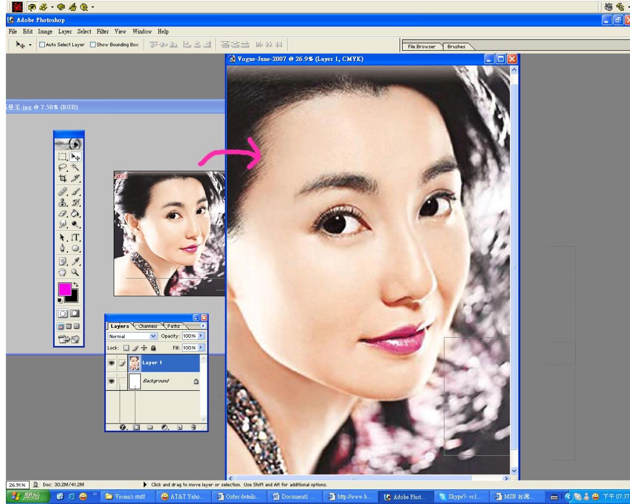
Assuming that Vogue designer is using photoshop for magazine cover, most likely the camera used could be digital, otherwise, use a scanner to scan the photo first. A file is created first, name, such as Vogue-June-2007, and then place the width/ Height/ resolution. Resolution is measured at dpi (dot per inch ) and higher resolution would mean a clearer imagine that could be easily manipulated for small technical corrections such as a pimple or a line wrinkle. Too low dpi will affect the image quality in which the image would be too grayish or snowy. After file creation is done, to enlarge or reduce size, click the image size from Image option in order to change the image from small pixel to large pixel. Then image size will be bigger and clear. Create a new file as Vogue-June-2007 and drag the picture file into the Vogue-June-2007 file. The photo would serve as the background. If the model has spot on her face, Clone stamp tool will serve for touch up. It is found in the tool box , click on it and hold on to T (type tool), and one can choose horizontal type or vertical type.
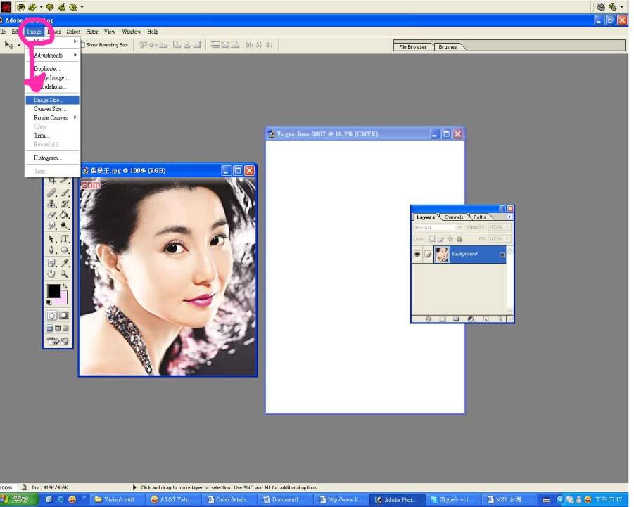
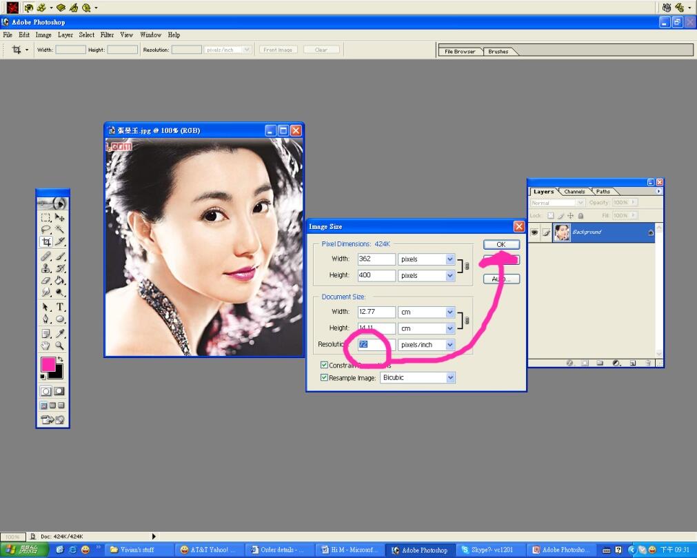
Image size box pop out when there is a need change resolution from lower to higher in order to get larger size of picuture.
When done with image size enlargement, drag the picture into another working file. save the working file as Vogue-June-2007.
Then, type as below: click left tool box and go to window-character. Adjust font size and distance from the character box.
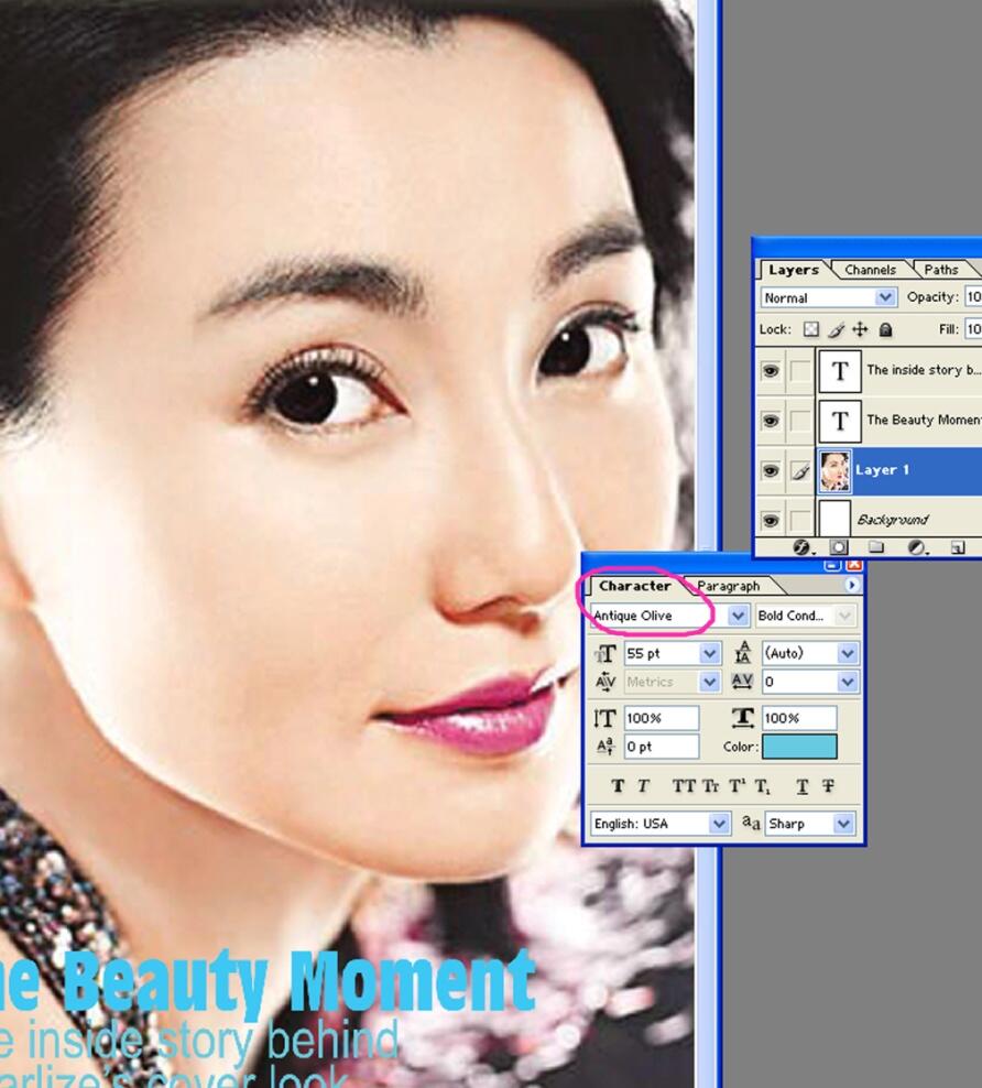
Artist may create as many layers as possible and then flatten the image from a small arrow at top right corner on the layer box, as seen in the picture below:
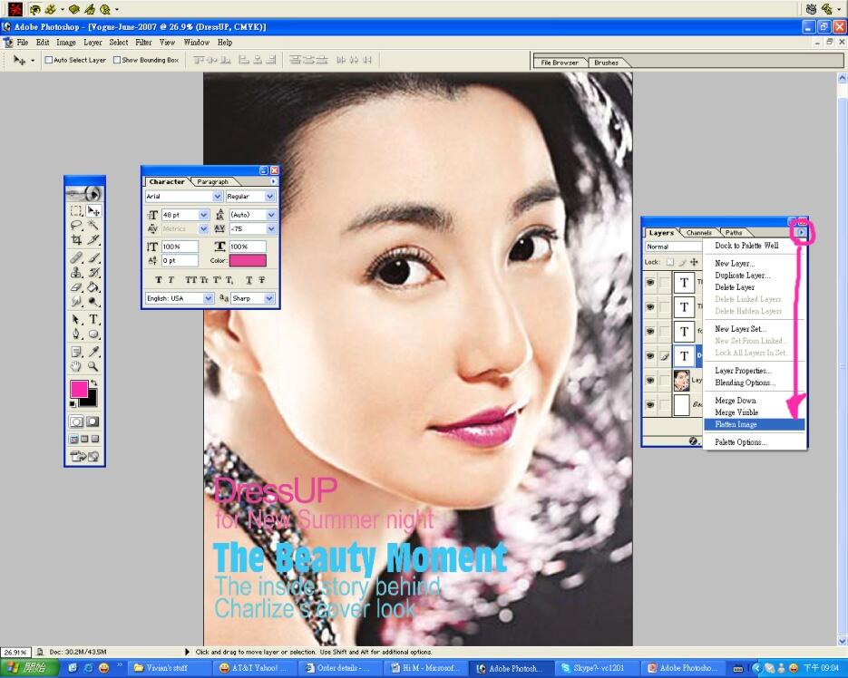
Then click on the highlight area, the all the layers will be flatten, and after the photo or image is flatten, the editing is final, the design could no longer be altered, unless saved as a new file.
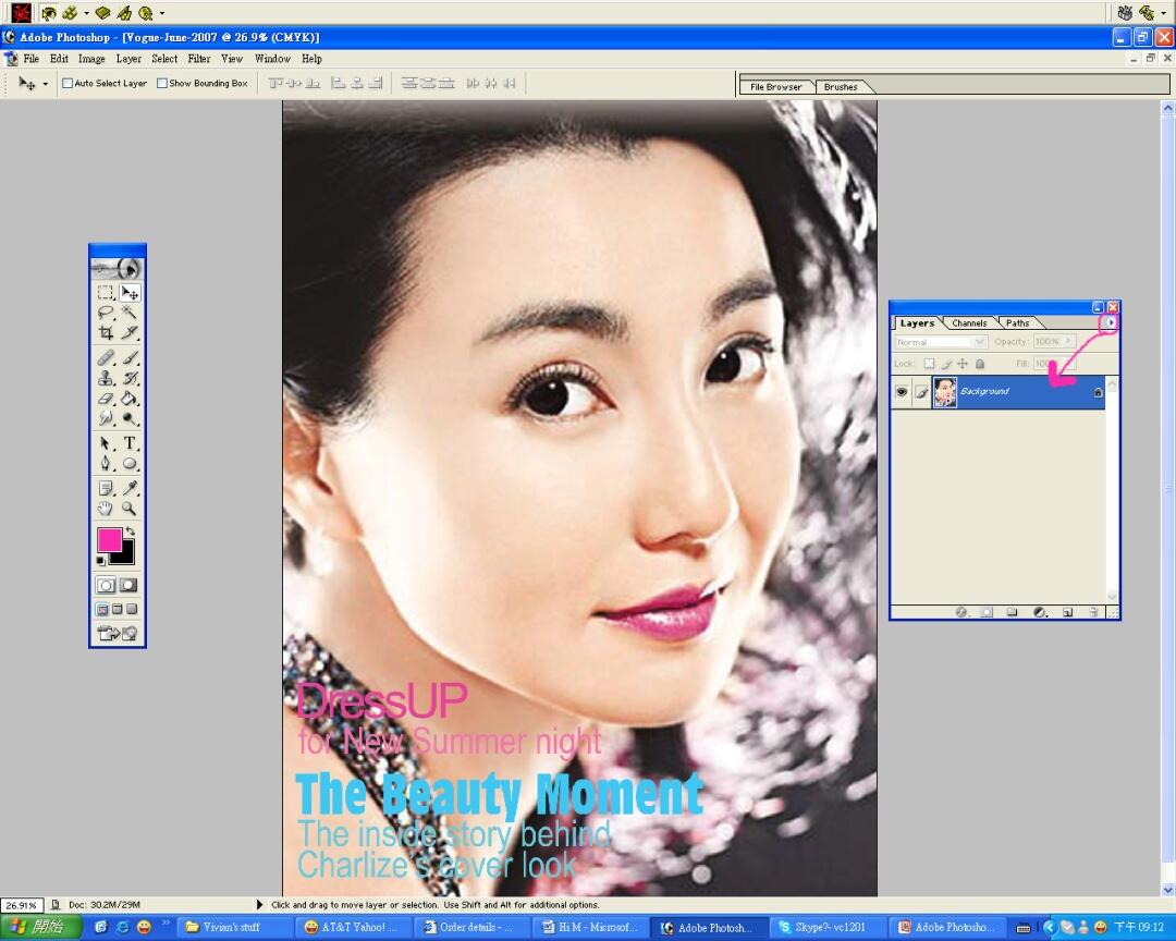
A Vogue pre-made frame would serve as another layer that could make the image look like Vogue magazine cover.
Data Analysis and Interpretation
Vogue Branding, Marketing and Packaging
Vogue, even as it was recognized for its revolutionary approaches to featuring fashion outbursts and rebellion, has maintained a cover design that speaks entirely of an identity: timeless elegance. With the use of minimal colors for coverlines and sometimes, even without it, Vogue exudes an aura of confidence and independence, to design and present as the editors and marketers deemed it practical.
Bierut (2004) at one time listening to George Lois legendary adman and designer for Esquire magazine, interviewed on radio, described Lois’ “…covers for Esquire in the sixties, the high point of his career and probably one of the high points in 20th century American graphic design, period.” Lois was quoted commenting when asked why (magazine) covers are not done the way they used to be, “They’re all infatuated with the idea that celebrity, pure celebrity, sells magazines.”
Celebrities
As for using celebrities in their cover, it was necessary that the models and artists featured on the covers of Vogue be identified in order to gauge the depth, complexity, or art work done on the models’ photos. In presenting the real persons on the cover, it is easier to identify reality from that which has been tampered on which is done through the use of first, make-up artists, second, expertise of photographers in light and shade, posing, blocking, among others, and last, computer graphics.
Vogue, as many other publications utilized computer graphics to improve on photos of the celebrities. As may be factual, although Kidman is known for her porcelain skin, blemishes such as freckles which are visible in Kidman’s photo presented above were “photoshopped” on the cover of Vogue as well as Vogue’s favorite cover model Kate Moss.
Turczyn (2005) found the contemporary magazine cover to have “has been vanquished by celebrity worship and bad taste… Artistic considerations are limited to how much retouching the celebrity headshot requires in Photoshop and how many headlines can be crammed in before the cover looks too “busy.” The result: A world in which it’s difficult to tell the difference between Playboy and Harper’s Bazaar without cracking them open.” Nevertheless, Turczyn (2002) pointed out that except for the paid advertisements, “Content-free periodicals like Flaunt, Clear, or Surface are little more than visual froth–they have no genuine editorial missions other than creating the appearance of importance. With little or no substance, these magazines’ graphic gymnastics spring from very thin air indeed. The photos and illustrations, no matter how elaborate they may be, depict only a dearth of true ideas. The end products are soulless, lifeless wastes of paper.”
An observation pointed out by Bierut (2004) is that “…magazines today… usually feature a really good photograph by a really good photographer of someone who has a new movie out, surrounded by handsome, often inventive typography. The worst magazines have a crummy picture of someone who has just been through some kind of scandal, surrounded by really awful typography.”
Same thing can be noticed in several covers for Vogue between July 1997 to June 2007 as can be glimpsed on Table 2. In between the majority of Moss and other supermodel covers are movie stars worth their lithe body shape to appear in a Vogue cover. Always, it was very notable that Vogue avoided celebrities that reached a certain weight limit known only to the Vogue insiders. Celebrities with the making of Vogue ideal weight were featured in the covers from time to time.
The many covers that featured waif-like and “heroin-chic” Kate Moss, however, showed the “rebellious” image as well as the “bad news sells” belief on the part of Vogue as Moss was more known for her antics and attitude rather than for her physical attributes as Ask Men writes, “Kate Moss can be attractive, but then again so can a giraffe with a good camera angle,” (Ask Men, 2007).
Logos, Colors, and Coverlines
In the December 1999 issue or the Special Millennium Issue, however, only texts were present on the cover of Vogue, all in Arial or similar typefaces.
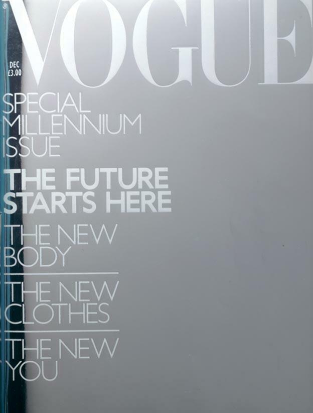
The cover indicates, if at all, total confidence in its contents and coverlines. The cover uses graduated silver shading as background with all-white texts including the magazine logo. What is striking about the coverlines is that these were all flushed left, with the logo on the top center which is its permanent position. The coverlines were differentiated through the use of a bolder text group, and use of horizontal lines separating coverline entries.
There were also Vogue cover issues that had single coverline on them: June 2000, December 2001, and December 2003 issues. Confidence and elegance were expressed to the buyers and readers in these instances where the Vogue cover spoke so little of itself. As for the issue that had no coverline was the Vogue tribute to the late Princess Diana. As is, the cover looked elegant and spoke for itself with the photo of the princess in a red dress. As much as the simplicity in design points to elegance, classic is clearly up next. Computer graphics, as is acknowledged for more than decades now as a necessity not only for “rushed” and necessary art or design, have been contributory in easing up lay-out and design of magazine coverlines.
Conclusion
It can be easily regarded that Vogue has established a reputation way beyond questioning eve before the advent of computer graphics. Way before, printers have found a way to handle demands and complex designs in packaging, as well as printing for demanding and detailed artists’, designers’, or even a team of artists, lay-out artists, designers and art directors’ finished output.
This study, has established that Vogue, with the use of computer graphics, has maintained a brand for the magazine which has long been established amongst its clientele or readers. For years, and even several span of decades, as mentioned elsewhere, the magazine catering to the mobile, upper-class, has expanded globally to include other nations’ and countries’ women.
Computer graphics, definitely contributed to maintain a better, more swift and elegant cover designs for Vogue with clearer, more playful ways as can be deemed at how hairs of cover models flow, float or fly smoothly, their skin as flawless as can be, or as naturally tanned as an all-year beach bum’s, as well as the playful arrangement of coverlines, with the light colored ones easily on top of a dark background, and a dark colored coverline on top of light background, with proper distance and sizes. Definitely, these advantages which can only be achieved through the advances in computer graphics have helped maintained the classic elegance Vogue has established throughout the decades.
Recommendation
Although Vogue made adjustments to cater to a wider audience, this, points to another study that needs more exploration. Adjustments on this has been mentioned elsewhere through the use of featured fashionable dress, or accessories, as well as newsworthy models or celebrities. The design, nevertheless, was kept, keeping a dedicated image that has stood the test of time.
References
- Angeletti, Norberto and Oliva, Alberto (2006). IN VOGUE: The Illustrated History of the World’s Most Famous Fashion Magazine. Rizzoli
- Ask Men. (2007). “Kate Moss.”
- Aspan, Maria (2007). “The Web Way to Magazine Ad Sales.” New York Times.
- Baird, R.N. (1993). Graphics of communication: methods, media and technology. Harcourt Brace Jovanovich College Publishers, Fort Worth
- Barchas, Janine (2003). Graphic Design, Print Culture, and the Eighteenth-Century Novel. Cambridge University Press.
- Berlyne, D.E. (1971). Aesthetics and psychobiology. Appleton-Century-Crofts.
- Bernstein, B. (1981). “Codes, modalities and the process of cultural reproduction: a model Language and Society 10, 327-363
- Bierut, Michael. (2004) “The Final Decline and Total Collapse of the American Magazine Cover.” Design Observer.
- Chandler, D. (2000). “Semiotics for beginners.”
- Cleveland, Paul (2005). “How much visual power can a magazine take?” Design Studies 26, 271-317.
- Crawforth, Hannah (2004). “Surrealism and the Fashion Magazine.” American Periodicals 14 (2) 212-244.
- Cunningham, J.B. (1993). Action research and organizational development. Praeger.
- De Grawe, S. (2003). “The possibility of minimal units in the filmic image,” from the Image [&] Narrative.
- Denzin, N.K. and Lincoln, Y.S. (1994). Handbook of qualitative research. Sage
- Garrity, Jane. (1999). “Selling Culture to the ‘Civilized’: Bloomsbury, British Vogue, and the Marketing of National Identity,” Modernism/modernity 6 (2).
- Graves, Robert and Alan Hodge (1963 ed.) The Long Week-End: A Social History of Great Britain, 1918-1939. Norton.
- Grow, Gerald. (2002). “Magazine Covers and Cover Lines: An Illustrated History.” Journal of Magazine and New Media Research.
- Harris, William Laurel (1918). “The Trade Press: its Functions.” The Metropolitan Museum of Art Bulletin 13 (5), 108-109
- Heller, S. (2003). Merz to Émigré and beyond: avant-garde magazine design of the twentieth century. Phaidon Press.
- Hodge, R. and Kress, G. (1988). Social Semiotics. Indiana University Press/Macmillan.
- Huysen, Andreas (1986). After the Great Divide: Modernism, Mass Culture Postmodernism. Indiana University Press.
- I’m Not Obsessed. (2007). “Nicole Kidman.”
- Johnson, Sammye, & Prijatel, Patricia. (2000). Magazine Publishing. Lincolnwood, IL: NTC/Contemporary.
- Kathman, Jerry (2002). “Brand Identity Development in the new Economy.” Design Issues 18, 1. 24-35
- Keeley, Larry. (2001). “Facts, Forces, Fog: Reckless Guesses in a Time of Change.” Blueprint 186.
- Kernan, Alvin and Michel Foucault (1987). Printing Technology, Letters and Samuel Johnson. Princeton University Press.
- King, S. (2001). Magazine design that works. Rockport Publishing
- Kress, G. and van Leeuwen, T. (1996). Reading images – the grammar of visual design. Routledge.
- Krauss, Rosalind (1987). “Preface” Poetic Injury: The Surrealist Legacy in Postmodernism Photography (Lynne Augeri, et al). The Alternative Museum.
- Krueger, R.A. (1988). Focus groups: A practical guide for applied research. Sage.
- Lee, Tyler. (2007). Vogue Covers.
- Lupton, Ellen (2007). “What is Success?” AIGA.
- Luckhurst, Nicola (1998). Bloomsbury in Vogue. Cecil Woolfe.
- Magazine Publishers of America (MPA) (2005). “American Society of Magazine Editors Unveils Top 40 Magazine Covers of the Last 40 Years.”
- Magazine Publishers of Australia (1999). Media qualities of magazines. Web.
- Marriott, K. and Meyer, B (eds) (___). Visual language theory. Springer
- Maghan, Shannon (1999). “Making the Teen Scene.” Publishers Weekly, 29-31.
- Merton, R.K., Fiske, M. and Kendall, P.L. (1990). The focused interview: A manual of problems and procedures (2nd ed.) Cllier McMillan.
- Mortimer, Raymond. (1924). “New Books for the Morning Room Table.” Vogue, 1924.
- Neuhaus, Cable. (2003). “The Cover Story, 2003: Inconclusive, Fascinating – magazine cover design.” The Magazine for Magazine Management.
- O’Sullivan, T. Hartley, J., Saunders, D., Montgomery, M. and Fiske, J. (1994). Key concepts in communication and cultural studies. Routledge.
- Owen, W. (1991). Magazine design. Laurence King.
- People (2007). “Nicole Kidman & Keith Urban Selling Nashville Home.” Web.
- Pearson, John. (1978). The Sitwells: A Family Biography. Harcourt.
- Pop Sugar (2007).
- Prior, Marcia (1980). “Vogue,” 1892-1928: An Historical Look at the Evolution of One Magazine’s Editorial-Advertising-Design Mix.” Paper presented at the Annual Meeting of the Association for Education in Journalism (63rd, Boston, MA, 1980).
- Reed, Christopher. “Design for (Queer) Living: Sexual Identity, performance, and Décor in British Vogue, 1922-1926.” GLQ 12:3
- Schmitt, Bernd. (2003) Customer Experience Management: A Revolutionary Approach to Connecting with Your Customers. Wiley.
- Scott, Richard (1998). “Survey Reveals Teen Book-Buying Habits.” American Booksellers Association 21.
- Smets, GJF and CJ Overbekee. (1995). “Expressing tastes in packages.” Design Studies 16. 349-365.
- Stewart, D.W. and Shamdasani, P.N. (1990). Focus groups: Theory and practice. Sage.
- Szczelkun, S. (2002). “Exploding cinema 1992-1999, culture and democracy.” Unpublished PhD thesis, Royal Academy of Art, London.
- Temperall, Paul (1999). Branding in Asia
- Turczyn, Coury (2005). “The Decline of Western Magazine Design.” Pop Cult.
- Weber, Caroline (2006). “Fashion Books: Review of “In Vogue: The Illustrated History of the World’s Most Famous Fashion Magazine (Rizzoli).” New York Times.
- White, Cyntha. (1970). Women’s Magazines, 1693-1968. Michael Joseph
- Yampbell, Cat. (2005) “Judging a Book by its Cover: Publishing Trends in Young Adult Literature.” The Lion and the Unicorn 29, 348-372. John Hopkins University Press.
- Yeah (2006). “Kate Moss is the World’s Ugliest Supermodel.”
- Yin, R. K. (1984). Case study research: Design and methods. Newbury Park, CA: Sage
Appendix
Appendix A
Appendix B