Introduction
Architecture is the outcome that results from the combination of art and science through planning, design and construction (Booth, 2011). Architecture has been used for years to represent the art and culture of all the civilizations that has been present in the world. Through architecture, societies have been able to identify and represent themselves and their values. This has been achieved through the uniqueness of their architectural designs that have differentiated them from other communities. In addition, different eras have always been represented by their dominant architectural designs. For instance, the romantic was represented by gothic, exotic and the Italianate architectural designs (Williams, 1996). Thus, architecture has been and is still being used as a representation of time, culture and modernization.
Like any other form of art, architecture has a number of basics that have to be applied in order to ensure that the overall design and construction is superb. Some of the basics of architecture include symmetry, asymmetry, scale and proportion. Symmetry is perhaps the most important aspect of architecture. Symmetry is the harmonic and aesthetic representation of proportion and balance. Symmetry has been represented in most architectural designs especially before the 20th century. Most buildings that were constructed during this era have a sense of balance and proportion that can be proven with the use of the rules of geometry and physics. Asymmetry on the other hand is a concept that has its roots in architecture. Representing the opposite of symmetry, asymmetry is used to refer to the non-correspondence of opposite sides of a design with regards to shape, size and space. Asymmetry has gradually developed in the architectural designs of the 20th and 21st century. Asymmetrical architectural design is thus the cultural representation of modern times. This difference brings us to the main point of discussion of the paper. The aim of this paper therefore is to differentiate between symmetrical and asymmetrical designs, their similarities, differences and representation in ancient and modern architectural designs.
Research Questions
To fully understand the effects of symmetry and asymmetry in architecture, this paper shall answer the following questions:
- Why have modern days architects abandoned traditional forms of symmetry in their designs?
- Does broken symmetry and unbroken symmetry have any link in contemporary way of thinking?
- What differences arise between Catholic and Orthodox architecture with regards to symmetrical and asymmetrical elements?
Symmetry
The leaning tower of Pisa, Taj Mahal, stature of liberty, the Sydney House of Opera, the demolished World Trade Centre and amongst others are buildings and monuments that have one thing in common; symmetry. Despite their differences in time and cultural representation, all of these buildings have different elements of symmetry that makes them to be unique features. If an axis is drawn through them, there will be equal representations on either side of the line. Symmetry has been one of the main fundamentals of art and architecture. It is due to this fact that Hargittai and Hargittai (1994) in their work asserted that symmetry is a unifying aspect in architecture. It is due to symmetry that all these buildings and monuments are viewed as similar in architecture.

Symmetry has been influenced by a number of factors most of which surround man in his environment. One of the main factors that have influenced the introduction of symmetry in architecture is the human body and the body of other living things. Most societies of the world believe that an almighty being (God) created man in his own image (Williams, 1996). Man is therefore the representation of God on earth. Through a careful analysis, it is evident that our bodies are symmetrical if an axis passes through our bodies dividing it into left and right planes. Man has thus used this concept to represent the beauty presented to them by God his/her designs. It is due to this fact that man used the concept of symmetry in art and construction. Most of the architectural designs in the 21st century contained a design that was symmetrical (Picon and Ponte, 2002).
Symmetry has also been included in architecture as a result of several other reasons. Economic, manufacturing, aesthetic and cultural considerations are but some of the factors that have influenced the use if symmetry in architecture. Just like any other form of art, architecture has widely used this concept in the process of planning and design (Gardner, 1999). Symmetry has been represented as a style of architecture in construction works of different cultures of the world, different eras and time periods and in different forms of construction. In architecture, different forms of symmetry have been used to represent the concept in different architectural designs over time. This has led to the development of the different views of architecture and as a result, arguments have emerged with regards to the concept. It is with regards to this issue that different architects choose the different forms of symmetry to represent different views in their designs and constructions (Gardner, 1999).
However, unlike the different forms of art, architectures views symmetry from a different perspective. Most forms of art view symmetry in a two dimensional perspective. While viewing symmetry in two dimensions, it is easier for an individual to understand and differentiate the different elements that are being portrayed by the aspect. In architecture, symmetry is viewed spatially in a three dimensional form (Hargattai and Hargattai, 1994). Due to this fact, the identification and inferences of symmetry becomes much more complicated since the aspect and symmetry changes within an object or a design as one moves around and through it. From different angles, an individual tends to have a different views and perspective of the object at hand. In architecture, the identification of symmetry becomes even much more complicated because one does not move around an object but inside it (Williams, 1996). This brings about a different view and experience of symmetry since architecture gives us the chance to view and experience architecture at the same time. This has been made possible due to the solid and void components that are represented in architecture.
In addition, architecture is represented by its specific elements. For instance, a gothic cathedral is represented by its pointed arches while a Greek temple is represented by its pediments. It is due to these elements that bring about the uniqueness of different architectural designs from different societies in different eras. In addition, these elements are responsible for bringing about symmetry due to the representation of balance and uniformity in their various designs. These solid elements are concentrated within a parcel of space that one goes through while traversing the building. This space represents the void elements of architecture that we normally experience while moving around a building (Williams, 1996). It is thus the main aim of architecture to shape the void element in order to develop a theatre of actions that will dictate the events that will take place within the building. This is achieved with the influence of aspect and proportion to bring out the desired results that an architect wants to achieve. Just like the solid elements of architecture, the void element also has symmetry. However, this symmetry is not seen but it is experienced.
To fully understand about symmetry and the effects that it has on architecture, this paper critically identified and analyzed the various forms of symmetry and the impacts that they have on various architectural designs. In architecture, there are a variety of symmetries. These include:
- Bilateral symmetry
- Rotation and retraction symmetry
- Cylindrical symmetry
- Chiral symmetry
- Similarity symmetry
- Spiral symmetry
- Translational symmetry
An architectural design can contain each one of these symmetries independently or it may incorporate multiple use of symmetries. Due to this fact, it is essential to discuss each and every one of these symmetries in detail.
Bilateral Symmetry
In architecture, symmetry is a term that is used to state that the corresponding sides of an object across an axis are similar (Williams, 1996). In bilateral symmetry, an imaginary line that passes through the centre of an object separates it into two different mirrored halves (Williams, 1996). The two halves that come up as a result of bilateral symmetry are identical. It is due to this fact that these halves are referred to as mirrored halves (Williams, 1996).
Bilateral symmetry is perhaps the oldest and most widely used form of symmetry in architecture. It is represented in all cultures, eras and epochs. For instance, during the early civilization, bilateral symmetry was found in the pantheon of Rome. Seventeen decades later, the same symmetry was found in the Alamo in Texas. This representation of symmetry in different eras represents the importance of bilateral symmetry as an integral part of architecture and a representation of culture.
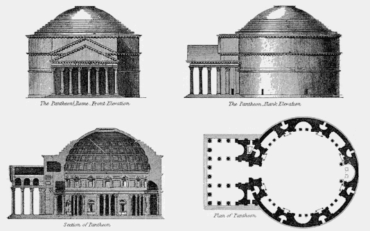
However, bilateral symmetry is not only represented on individual buildings. In complicated architectural planning and designs, bilateral symmetry has been represented in wider scales. For instance, the designs of most urban cities have bilateral symmetry. A prime example of a series of constructions that represent bilateral symmetry in an urban setting is the PraHo do Comercio (Gotze, 1998). Located in Lisbon, Portugal, the square comprises of a city square, a monumental gate and an avenue extending beyond the gate. Bilateral symmetry is exhibited from the horizontal axis that our vision relies upon.
As discussed earlier, symmetry may have been introduced in art as a result of the observation of nature that surrounds man. Most of the living things, including the human body, portray bilateral symmetry. As it has always been believed, man was created from the image of God. On the other hand, man has created art and to express its beauty, he has used the concept of symmetry. During ancient time, bilateral symmetry was the most widely used form of symmetry since it conformed to man and the environment that surrounds him. That is why bilateral symmetry has always been represented in all cultures and eras.
However, it should be noted that there are two different schemes of bilateral symmetry. These are represented on different facades. The first scheme of bilateral symmetry represents a facade that has even number of bays. This form of bilateral symmetry is a classical example of catholic architecture. Here, the axis divides the building into two equal halves that have even numbered bays.
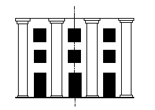
On the other hand, the second scheme of bilateral symmetry represents a facade that has uneven numbers of bays. In such a symmetry, the numbers of bays represented in each half will be different. This is a classical example of orthodox bilateral symmetry in which dualism arises as a result of the symmetry in the bays (Williams, 1996).
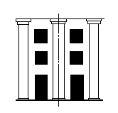
Dualism is a state that has always been avoided since the times of ancient architecture. Temples found in Greece portray a facade construction that has even numbered bays. This was done to ensure that an axis does not develop in the column located at the centre of the pillars. This concept was advanced by early architects as a result of the ambiguity that was related to the number ‘2’ (Williams, 1996). In ancient mythology, 2 was considered as a suspicious number. This is due to the fact that it could be divisible into equal halves (with regards to Pythagoras suspicion). It was thus referred to as the female number and disregarded as the number ‘3’. 3 was regarded as the male number and is accredited in architecture since it cannot be divided into half. The same concept is still being practiced in modern architecture. Dualism is always considered as an elementary mistake in architecture.
However, it should be noted that despite the fact that dualism is not advocated, it does not mean that it is absent. There are a number of buildings that have been designed using dualism. A prime example is the Oratory of Orsanmichele that is located in Florence. Constructed in the 14th century, the building as a peculiar design. It consists of two floors; a ground floor and an upper floor. The building has a peculiar aisled plan that consist of two different alters. These alters bring about the concept of dualism. In most cases, these two alters bring about a lot of confusion as individuals have to choose whether to stand in front of one alter or the other. This can be compared to the confusion that is brought about by a house that consists of two front doors. People who want to get in or out of the house have to decide which door to use. From the designs of architecture, dualism tends to bring about confusion. In the case of the house with two front doors, the architect normally gets a hard time in deciding which door he will use as the main entrance. On the other hand, an individual has the trouble to decide which door he/she will use. Thus, dualism as a concept brings decision-making problems to both the architect and the viewer. To avoid this, architects have always disregarded the concept of dualism. To solve such a problems, architect normally design housed with only one door on the front facade and to eliminate any chances of confusion. Consequently, churches embraced the design of having only one alter in order to avoid dualism.
Rotation and Reflection Symmetry
Architecture comprises of two elements; the solid element and the void element. The solid element is normally represented by the arches and pediments that brings about the general view of architecture that we embrace. Within these solid elements, there is an envelope of space that masks the solid elements of architecture. This void brings about the aspect of architecture that we experience. We not only go through this space but also walk within it and view the building from different perspectives and symmetries. All this has been made possible by rotational and reflection symmetry (Williams, 1996).
In rotational symmetry, the building is rotated around a central spot along the axis bringing about the effect of multiple reflections. This brings about a sense of movement and rhythm while an individual experiences the void elements of architecture. This form of symmetry is normally found in buildings that are hemispherical in nature. As an individual moves within the building, he/she is able to experience the void within the building and view its symmetry from multiple perspectives. Domes also exhibit rotational symmetry with an emphasis of their central region. A prime example of rotational and reflection symmetry is exhibited by the works of Giuliano da San Gallo in the construction of the S. Spirito during the last years of the 1500s. In this work, Guiliano managed to present rotational and reflection symmetry by the building to have an octagon shape with an elongated pavement. Rotation and reflection symmetry is represented as a result of the octagonal shape of the building.
Cylindrical Symmetry
This form of symmetry is mainly represented in towers and columns. The main element that is presented by this form of symmetry is the defiance of the rule of gravity. Through their constructions, towers and columns seem to resist the pull of gravity; a law of nature. There are several buildings that have cylindrical symmetry. For instance, the cenotaph, designed in the 18th century by Etienne-Louis Boulée is a prime example of a construction that represents cylindrical symmetry. On rare occasions, spherical symmetry can be displayed in architecture. However, it is difficult for such designs to be constructed. In addition, the determination of symmetry for such a building shall be difficult since humans walk on a horizontal plane. Thus, from such a perspective, it is virtually impossible to determine symmetry.
Chiral Symmetry
The symmetries that have been discussed in this paper so far are so common. However, chiral symmetry represents one of the most rare types of symmetries that is frequently used in the arts and architecture. In chiral symmetry, the opposite side of a structure/building form mirror images of one another. However, these sides cannot be superimposed. The same principles apply to the limbs of animals; they are identical but cannot be superimposed together. Several famous buildings and structures from different eras have been constructed using this type of symmetry. Chiral symmetry always expresses a lot of emphasis on the centre that exists between the two buildings or opposite sides. Cesar Pelli work on the Petronas Towers in Malaysia is a provides a good example of chiral symmetry (Gardner, 1999). Other buildings include the Puerta de Europa in Spain and Piazza of Saint Peter’s in Vatican City. The Petronas Towers and Puerta de Europa represent modern works of architecture. However, the Paizza of Saint Peters represents an ancient work of architecture. This thus states that chiral symmetry has always been used as a style of architecture for since the beginning of civilization.

Similarity Symmetry
Similarity symmetry is also another form of symmetry that has begun to find a lot of application in architecture. Unlike other types of symmetry where opposable sides of a building look identical and have similar proportion, objects that have similarity symmetry also are identical but posses different proportions (Williams, 1996). Thus, an opposable object may be larger or smaller but identical in shape and structure. This form of symmetry is always associated with fractals. A building that provides a perfect example of this type of symmetry is the roof of Sydney Opera house. Constructed in 1959 by Joern Utzon, the roof of this building are parts of a shell. They therefore have the same shape and design. However, their sizes and inclination are different. This thus brings about the difference in size and inclination. Castel Del Monte in Italy is also another example of similarity symmetry. The outer walls of the castle and the walls inside the court are similar. However, the inside walls have a smaller proportion as compared to the outer walls despite the fact that they have the same shape.

Spiral Symmetry
Spiral symmetry is also called helical symmetry. Spirals and helixes in architectural language are symbols of continuity. A spiral line in architecture represent continuity from one level to another within space. On the other hand, Frank Lloyd, while designing the Guggenheim Museum of New York used the helix whereby the exterior of the museum is a gigantic representation of the ramp in the interior. People while visiting the museum use the elevator to reach the top of the ramp and spiral their way down while enjoying the magnificent work of art. Despite the tremendous work of architecture that was presented by this design, critics suggested that the design has an effect of making the visitors go out of the building much faster. The downward spiral design makes visitors to go out of the museum much faster that intended. This may be accredited to the force of gravity that visitors at the museum are usually unaware of. It has also been suggested that Lloyd was more interested with the architectural part of the design than the its utilization for art as a museum. Thus, he designed the building to have a tremendous view but with little enjoyment of the art that it holds. Despite these criticisms, the spiral symmetry that the building portrays represents spatial continuity; a critical element in architecture.
Translational Symmetry
Translational symmetry, being part of the space group symmetry, is one of the most common types of symmetry found in architecture (Williams, 1996). This type of symmetry arises as a result of the translation of elements in one direction resulting into the development of columns or rows. This type of symmetry is very common especially in the urban designs of buildings that were constructed in the 20th century. It is due to this fact that the most of the architectural designs of the 20th century are referred to as boring. The massive repetition of construction results to monotony of a given design. This also shows lack of creativity in design.
Multiple Symmetry
The various kinds of symmetry that have been presented in this paper are very useful in arts and architecture. However, it should be noted that buildings do not only have one specific type of symmetry on their design (Williams, 1996). On one different perspective, an individual can be able to recognize different kinds of symmetries. These symmetries can also vary depending on the position of an individual relative to the building and whether an individual is inside or outside of the building. The Chinese Pagoda is perhaps a building that clearly represents multiple symmetries. On a plain vertical view, it is possible for an individual to identify cylindrical symmetry and similarity symmetry. Diminishing symmetry can be identified from the organization of the solid elements of the building. On the other hand, similarity symmetry can be identified on the diminishing size of the roof elements. Ancient Greek and Roman temples also exhibit multiple symmetries. On their facade, bilateral symmetry can be identified easily. On the other hand, translation symmetry can also be identified due to the development of columns and rows of the bays on the façade of the building.
The void element of architecture also provides the chance for one to identify multiple symmetries. Domes are some of the features in which multiple symmetry with regards to the solid and void elements of architecture can be identified. When an individual observes a dome from the outside, one will discover that it is organized on a vertical axis. However, once a dome is observed from the inside, one will discover that it is organized from a central point. These changes in organization represent multiple symmetry with regards to the void and solid elements of architecture.
The presence of elements in a building also enable multiple symmetry to arise. The distribution, arrangement of solid, and elements in a building increase the presence of symmetry in a building. These elements can have symmetry on their own or collectively as a group (Williams, 1996). In catholic architecture especially from the gothic era, the arches that were found on the facade of the church provided multiple symmetry. These symmetries arise as a result of the position of these arches (elements) with regards to the building itself. In architecture, buildings are designed in such a way to enable one to experience the void and spatial elements of the building. As such, architects design building with a series of spaces that are distributed sequentially. Thus, as one goes around the building, he/she experiences the different elements in a sequential manner. Many scholars compare this phenomenon to storytelling; it is like the architect is telling a story about the design of the house. This has increased the level at which we view and appreciate architecture.
The Paizza of Saint Peters provides one of the designs that represent multiple symmetry and its elements are arranged sequentially. While standing at the Paizza, it is very easy for one to identify bilateral symmetry through the observation of the facade. However, when one begins to move around, various elements of the design are also identified. The columned porch is one of the things that one can easily identify. The rotunda and the intermediate block. All these elements are arranges in sequence. When once enters the Paizza, he/she is able to see all these three elements on a horizontal plane. From this view, bilateral symmetry is easily identified. The horizontal plane soon disappears and is replaced by a vertical view of the pavement that leads to the rotunda. Here, two symmetries can be identified; cylindrical symmetry and rotation and reflection symmetry. These two symmetries thus replace bilateral symmetry as the dominant symmetry of the building. These changes in symmetry are essential as they represent the changes in space that one experiences while moving around the temple. The Pantheon is a temple that is dedicated to the gods. Its design is a representation of a number of elements of the universe. First, the rotunda itself represents the universe in which the gods dwell and rein. It is round, vast and expansive. Half of the rotunda is coffered while the other half is made up of implicit elements. The coffered part represents the crown of the space while the implicit part represents the elements that are present in space. The dome contains numerous symmetries and elements. These are a representation of infinity. This is symbolism for the cosmos. Thus, multiple symmetry can be used as symbolism for a number of elements in the physical world.
Symmetry in Space
Symmetry is an essential element in art. In most forms of art, it is viewed in two dimensions. This is in the vertical and horizontal plane. However, architecture has brought about a different mode of viewing symmetry. In architecture, symmetry is viewed in three dimensions. This comes about due to the presence of the void elements (Gotze, 1998). The void element gives us a chance to identify symmetries that we cannot see but experience. While describing and experiencing the spatial element of architecture, two concepts are essential in describing this space and its symmetry. These concepts are the centre and the path (Williams, 1996). In architecture, the centre is the most important point about which all the other space seems to originate from. On the other hand, the path the space through which an observer moves through while traversing the architectural space in a building. In catholic architecture, the centre can be compared to the alter while the path can be compared to the space between the rows of seats towards the alter. It has always been asserted that a church must have centre and path elements. However, the relationship between these two concepts always differs. This is an essential factor as it brings about the difference in the manner that we view the architectural space from different time periods.
However, since this paper is mainly interested in symmetry. With regards to this, the centre shall be viewed as a point while the path shall be viewed as an axis. It is the relationship that exists between the point and the axis that shall determine the architectural symmetry that exists in the space of a building. From the studies that have been conducted in the field of architecture, the relationship that exists between the centre and path has been used to show the evolution of architecture from as far as 1500 years ago (Williams, 1996). From these studies, it was identified that as this relationship changed and evolved, so did the types of symmetries present in architecture. For instance, in ancient Roman architecture, the relationship that exists between the centre and the path brings about the element of balance and equilibrium than the expression of dynamic movement (Gotze, 1998).
Early architectural works were constructed using the design of the Roman basilica. This was a building that was used as a courthouse. The design of this building portrays a good example of how spatial symmetry of ancient buildings was used to express balance and equilibrium rather than continuity. This building was rectangular. It has arches on either end of the major axis. At the middle of each of the minor axis was a doorway, each opposable to one another. In early Roman architectural designs, elements were placed in such a way that they became opposable to each other. In the Roman basilica for instance, the apses, doorway and columns were all opposite to each other.
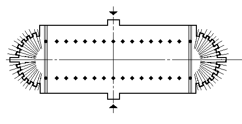
This design emphasizes more on balance and equilibrium rather than dynamic movement. The rotunda of the Pantheon is also another architectural work that has the same concept of equilibrium as a result of symmetry as the Roman basilica. Despite the fact that the rotunda has a circular shape, the concept behind the arrangement of its elements is similar to that of the Roman basilica. This design also represents opposition, as apse is opposite to apse, column-to-column, and niche-to-niche (Williams, 1996). From these examples, it is evident that in Roman architecture, the axis brings about an element of balance. It is however, essential to point out that neither the centre nor the path in the roman architecture dictated the direction of movement of the observer. For instance, the symmetry that arises from the axis is not in line with the pavement that leads to the entrance of the rotunda and the pathway to the pavement.
During the early days of civilization, Christianity was not a legal religion. This is due to the fact that it went against the laws of the Roman Empire. As a result, this religion was practiced in secrecy. Due to this fact, Christians did not have specific places of worship. However, during the 4th century, the religion was legalized. To build a place of worship, Christian architects adopted the plan of the Roman basilica. However, on their designs, a number of differences were identified. This also changes the concept of centre, path and symmetry at large (Gotze, 1998).
On their design, Christian architects removed one of the apse and moved the doorways from the minor axis to the major axes. Thus, their design only had one doorway and one apse at the end. This design in turn altered the centre and path elements of the design and the symmetry at large. Unlike the Roman basilica that had the alter at the middle of the building, the Christian alter was located at one end of the building on the apse.
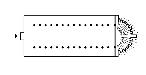
From this design, bilateral symmetry was the only type of symmetry that could be identified. This came about due to the presence of only one plane of reflection and no planes of rotation (Williams, 1996). In this design, the axis of symmetry is at the same time the path of the design. Thus, the symmetrical design of Christian churches during this period represented the presence of movement. This is because the axis of symmetry dictated the path through which an observer passed through while traversing the spatial element of the buildings architecture. This concept, in early Christianity, represented the pilgrimage movement into the kingdom of God. In addition, bilateral symmetry played a critical role in Christian architecture between 300 and 1300 AD as it represented the Christianity ideal and the longitudinal axis along which the earth is based on. This presence of movement with regards to symmetry is what the roman architecture lacked.
During the renaissance period up to the present times, rotation and reflection symmetry has been used to emphasize the centre and path of churches. Using the logarithmic spiral, a curvilinear rotation about the centre of symmetry in forward and reverse direction that is present in this design. Depending on the times of rotations that results into changes in proportions as one moves from the centre of the axis, the shape and design of the motif remains the same. This brings about similarity, rotation and reflection symmetry that is present in modern architectural design. Therefore, the changes in symmetry can be used as a tool to understand the development and history of architecture.
Importance of Symmetry in Architecture
Symmetry is an essential aspect in architecture. A thorough understanding of symmetry is essential to an architect as it gives him the opportunity of describing his design and expressing its possibilities. In addition, an observer is able to understand, observe and appreciate the solid and void elements of architecture. However, there are some of the architectural designs that do not follow the rules of symmetry. The Baptistery of Pisa and the Pantheon of Rome are examples. In the Baptistery of Pisa, has a rotation of 12 and 20 while the Pantheon of Rome has a base that has four fold rotations and a dome that has 27 rotations. This resultant effect of this fact is that these reflections are not divisible resulting into broken/asymmetry. This concept has found a lot of application in modern architecture. Buildings such as the Beijing CCTV building and the Turning Torso in Sweden.
Asymmetry (Broken Symmetry)
From the works that have been discussed so far, it has emerged that there is a balance between the elements of architecture in the opposites sides of a buildings across an axial plane of symmetry (Williams, 1996). However, there are those architectural designs in which the elements are unequally distributed thus creating an imbalance. This state of lack of balance in the elements of architecture is referred to as asymmetry. In all asymmetrical designs, the element of symmetry that should have existed is broken. It is due to this fact that such a symmetry is also referred to as broken symmetry (Gardner, 1999). There are several designs that may bring about the effect of broken symmetry in a given structure. In normal circumstances, a door is normally situated at the middle of the facade. However, there are those designs in which the door is situated too much on one side of the facade. On the other hand, there are those buildings that have windows that are arranged in an irregular pattern. This two situations are primary examples of broken symmetries. In such designs, it is impossible to get a mirrored image of each half on any plane despite the number and extent of rotations that you might put it into.

In ancient designs, the element of symmetry was seldomly used by architects. However, since the 21st century, the extent to which this style has been utilized has increased tremendously. Asymmetry, as an architectural design is a style that is used to show informality, movement and on some rare occasions, surprise. The Victorians, for instance, embraced the concept of asymmetry in their architectural designs. They believed that the ruggedness that was presented with this design resulted to an element of harmony with nature. One of the modern architects that has embraced this concept fully is Mier van der Rohe. In one of his designs, the walls and glass compartments have been positioned in an irregular way. This brings about a feeling of continuity between the indoors and the outdoors (Gotze, 1998). Asymmetry also brings about a tension effect in architecture (Williams, 1996). This arises when openings in a building such as windows or vents and solid elements such as closets, chimneys or arches are placed asymmetrically within a symmetrical space. The tension that arises brings about a feeling of dynamism.
The Tower of Pisa
The Tower of Pisa the bell tower of the cathedral located at Pisa. This is one of the oldest structure that has been constructed in Pisa history (Speicer, 2008). Despite the fact that this building forms one of the oldest and fascinating structures of architecture, its design is one of the most amazing in the world. The tower slants to the right at an angle of 3.99 degrees. This slant came about as a result of its construction. Construction of the tower commenced at 1173. However, due to the weak soil of the site, the tower begun to sink on one side when construction reached the second floor in 1178. At the same time, the republic of Pisa was constantly involved in war with neighbouring states. As a result, construction was halted for over a century. Scholars normally state that this delay in construction may have contributed greatly to the stability of soil at the site hence supporting the tower. In addition, the consequent floor were constructed in such a way that one side is taller than the other to maintain balance and stability.
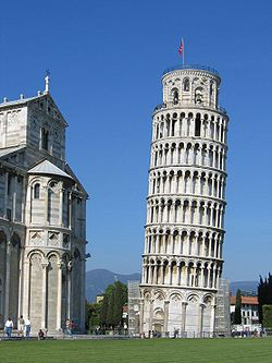
However, it is not the fact that the tower is leaning that results into it being asymmetrical but the fact that its elements found on opposite ends do not balance. In its structure, the walls of the ground floor with arches. These arches rest on a series of half pillars. The other levels have double the number of arches as that of the ground floor. The highest level (the eighth floor) is relatively smaller as compared to the others. To determine the number of finite symmetry of a building, one needs to count the number of arches and pillars. In most occasions, the resultant figure should be an even number. However, for the case of the Tower of Pisa, the lower floor has 15 pillars while the consequent floors each have 30. This brings about broken symmetry on its structure.
The Pantheon of Rome
Built between 118 and 125 AD, the Pantheon of Rome is one of the oldest buildings to be built in ancient Rome. This temple was constructed to honour the gods of the pagan Roman during ancient time. The current pantheon was constructed under the directions of Hadrian who constructed the temple to replace the old Pantheon that was constructed by Marcus Agrippa that was burnt to the ground in 80 AD. Due to this fact and the religious importance that the temple had, it became to be one of the most appreciated works of architecture of ancient Rome.
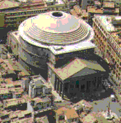
The architecture of the Pantheon of Rome is spectacular. Its design consists of a series of arches. In the rotunda, these arches run horizontally to support the weight of the dome shaped roof. At the centre of the dome is an opening that is referred to as the oculus. This opening is the only source of light to the interior of the rotunda. From plain analysis, the rotunda exhibits translational, circular and reflection symmetries. However, the floor of the rotunda has four planes of reflection. In addition to this, it has fourfold rotation. The dome on the other hand has 27 folds of rotation. These folds of rotation between the floor and the roof do not have a common divisor. This in turn leads to the breaking of symmetry.
TheTri-Span Sculpture
Fermilab (Fermi National Accelerator Laboratory) is a laboratory that conducts experiments of the department of energy in the United States. Located at Illinois, Chicago, the fermilab is responsible for conducting research on high energy particle physics. The lab consist of innovative and creative scientist who conduct research on almost every aspect of particulate matter. Among their main goals is to determine the origin of the universe, what it is made of and its composition. In addition, the lab has also been involved in art and artefacts.
One of the labs most amazing work of art is the Tri-Span Sculpture that is located at Pine Street near Kirk Road. The sculpture comprises of three sculptures of different heights with the tallest standing at 50 feet. It weighs approximately 42,000 Ibs (Fermilab, 1978). The sculpture, being an outcome of a project that incorporates science and architecture is perfectly symmetrical from several points of view. Looking at the sculpture directly above it, at its centre and directly below it, several planes of symmetry can be identified. However, when other factors and elements of architecture are considered, the element of broken symmetry is identified.
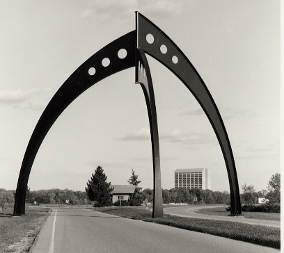
The Tri-Span Sculpture was designed by the fermilab director, R.R. Wilson. In his design, Wilson adopted the concept of Alexandra Calder to bring out the concept of symmetry and asymmetry (Fermilab, 1978). These concepts are essential since they being out several relationship of elementary particle physics; one of the studies and research that is conducted at fermilab. As a result, the sculpture presented a magnificent work of representing asymmetry in science and architecture. When considering the east leg, two-fold symmetry that is almost perfect is identified. On the other hand, three-fold symmetry can be identified at the base of the sculpture. However, this symmetry declines with elevation which becomes completely broken at the top (Fermilab, 1978).
The Development of the Concept of Symmetry and Broken Symmetry in Modern Architecture
Symmetry and asymmetry are some of the essential aspects of architecture. The concept of symmetry and asymmetry has been used for thousands of years and given the current trend in architecture, this concepts will still be used even in future designs. Architecture has adopted the concept of symmetry and asymmetry from nature and the environment that man lives in. Through observation the of nature, man has adopted and implemented the concept of symmetry and asymmetry in architecture like a form of his appreciation of the magnificent work of art that surrounds him.
Symmetry, for instance, is found in a most of the architectural designs present in the world. Symmetry is a concept that is identified with the presence of corresponding parts on opposite sides of an axis (Zachary, 2010). As a result of its importance, symmetry has developed to be an integral part of architecture. It is used to describe the notion that a design has been well thought. This form of thought is exhibited by the presence of balance on the work. That is why the elements on each side of an axis balance (Dietsch, 2011). The pyramids of Egypt, the Taj Mahal, the Pantheon of Rome, the many cathedrals, the works of the renaissance and so on all have different elements of symmetry. Symmetry is also found in modern architecture. The works of individuals like Luis Khan, Philip Johnson and currently Karl Trevor (Booth, 2011). Symmetry has been used as a means of creating something beautiful and full of inspiration. On careful inspection, it is evident that out bodies and the bodies of many other living things out there are not symmetrical. Many individuals assert that it is perhaps due to the fact that most of the things that we see in nature are not perfectly symmetrical that man developed the interest of symmetry and increasing its perfection.
Asymmetry on the other hand means that the elements found on either side of an axis are not identical. Asymmetry may be visible or not. For instance, when we examine the human brain, its shape seems to be perfectly symmetrical. However, each of these halves has a different role and function. It is due to this fact that the human brain is asymmetrical. Consequently, there are buildings that have been designed in such a way that they seem symmetrical but they are not. The facade of some of the cathedrals, for instance, may seem to be perfectly symmetrical. However, this symmetry is broken due to the difference of their arches.
In modern architecture, the concept of symmetry has taken a new direction. This is because most of the buildings that have been designed since the 20th century and embrace the concept of asymmetry do not try to be symmetrical at all. The golden rectangle is always describes as a divine work of art. This is because of the uniqueness of its shape and proportion. It is possible for one to draw a spiral in it. However, when an axis divides it into equal left and right halves, the resultant image is not symmetrical.
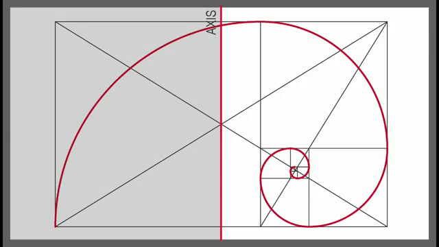
However, on careful analysis, the order its elements are arranged sequentially. It is this very same order that is found in nature and what architects strive to achieve in asymmetry. Thus, order in asymmetry is not achieved by the manner in which a design appears but on how it functions. With this respect therefore, architects such as Le Corbusier, Walter Gropius and Frank Lloyd strive to create orderly spaces on their designs for their designs to meet the functions that are required by their clients.
Contemporary Architecture
Modern architecture has based its roots mainly on asymmetry. While there are many buildings that have been designed and constructed in the modern era that are perfectly symmetrical, asymmetry has emerged as a concept that can be used to describe the architectural work from the 20th century. However, it is through the mixture of symmetry and asymmetry that contemporary architects have found an avenue to express their personal thoughts and ideas. This led to the emergence of the of the modern architectural movement. Symmetry was identified as an architectural design that embraced the balance and equilibrium that was present in nature. However, with asymmetry, architecture plays an even greater role of representing nature with its ruggedness and at the same time give the architecture a chance to develop simple, abstract and light architecture that represents modern architecture.
Conclusion
Architecture as a mixture of science and art has always been a representation of man interpretation and appreciation of nature and his surroundings. Through symmetry and asymmetry, architects have been able to come up with designs that gives out a lot of information with regards to culture, time, development and evolution of the human nature. From the constructions such as the Roman Pantheon, the gothic cathedrals, constructions of the renaissance up to the present designs, a gradual transition in style and symmetry represents the changes that have been experienced with time.
References
Booth, N 2011, Foundations of Landscape Architecture: Integrating Form and Space Using the Language of Site Design, John Wiley & Sons, London
Dietsch, D 2011, Architecture for Dummies, John Wiley & Sons, London Fermilab 1978, ‘Fermilab History and Archived Projects’, Ferminews, Vol 1 No. 7, pp. 21-30
Gardner, M 1999, Ambidextrous Universe: Symmetry and Asymmetry from Mirror Reflections to Superstrings, Sage, London
Gotze, H 1998, ‘Friedrich II and the Love of Geometry’, Nexus: Architecture and Mathematics, Edizioni dell’Erba, Florence
Hargittai, I and Hargittai, M 1994, Symmetry: A Unifying Concept, California: Shelter Publications, Bolinasю
Picon, A and Ponte, A 2002, Architecture and the Sciences: Exchanging Metaphors, Sage, Rome
Speicer, D 2008, Leaning Tower of Pisa: Architecture, Web.
Williams, K 1996, ‘The Universality of the Symmetry Concept’, Nexus: Architecture and Mathematics, Edizioni dell’Erba, Florence
Zachary, M 2010 ‘Symmetry and Asymmetry in Architecture’, Journal of Modern Arts and Sciences, Vol. 2 No. 1, pp. 67-75